July 28, 2026
How to Resize Images Without Losing Quality (2026 Guide)
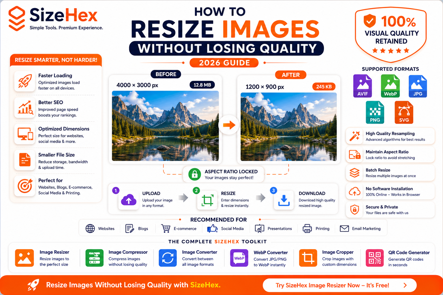
How to Resize Images Without Losing Quality
Images are essential for modern websites, online stores, blogs, presentations, and social media. High-quality visuals capture attention, improve engagement, and make your content look more professional. However, using images with the wrong dimensions can lead to blurry visuals, slow-loading pages, poor user experience, and wasted storage space.
That's why resizing images correctly is just as important as compressing them.
Image resizing allows you to adjust the width and height of an image to match its intended purpose while maintaining the best possible quality. Whether you're preparing a blog banner, a product photo, a social media post, or a website hero image, resizing helps ensure your images look sharp without being unnecessarily large.
Modern image resizing tools use advanced resampling algorithms to preserve details and reduce quality loss, making it possible to resize images efficiently for almost any platform.
In this guide, you'll learn how image resizing works, how it differs from image compression, why it matters for SEO and website performance, and the best practices for resizing images without sacrificing visual quality.
What Is Image Resizing?
Image resizing is the process of changing an image's dimensions by adjusting its width and height, measured in pixels.
For example:
| Original Image | Resized Image |
|---|---|
| 4000 × 3000 px | 1200 × 900 px |
The resized image contains fewer pixels, making it more suitable for websites, blogs, social media, and mobile devices.
Unlike cropping, resizing keeps the entire image while changing its overall dimensions.
Resizing can:
- Reduce image dimensions
- Increase image dimensions (upscaling)
- Optimize images for specific devices
- Improve website performance
- Save storage space
Resize vs Compress: What's the Difference?
Many people confuse image resizing with image compression, but they solve different problems.
| Feature | Image Resizing | Image Compression |
|---|---|---|
| Changes Image Dimensions | ✅ | ❌ |
| Reduces File Size | ✅ Often | ✅ Yes |
| Changes Pixel Count | ✅ | ❌ |
| Maintains Original Dimensions | ❌ | ✅ |
| Improves Website Speed | ✅ | ✅ |
| Best For | Correct image size | Smaller file size |
Image Resizing
Resizing changes the actual dimensions of an image.
Example:
4000 × 3000 px
↓
1200 × 900 px
The image becomes smaller because it contains fewer pixels.
Image Compression
Compression keeps the dimensions the same but reduces the amount of data needed to store the image.
Example:
1200 × 900 px
↓
1200 × 900 px
File size:
2 MB
↓
450 KB
No dimension changes occur.
Best Practice
For optimal performance:
- Resize the image to the required dimensions.
- Compress the resized image.
- Upload the optimized version.
This workflow provides the best balance of image quality and loading speed.
Why Image Resizing Matters
Resizing isn't just about making images smaller—it directly affects website performance, user experience, and storage efficiency.
1. Faster Website Loading
Large images require more data to download.
Properly resized images:
- Load faster
- Improve browsing experience
- Reduce waiting time
- Increase visitor satisfaction
2. Better SEO
Search engines value websites that load quickly.
Correctly sized images help improve:
- Core Web Vitals
- PageSpeed Insights scores
- Mobile performance
- Crawl efficiency
This supports stronger technical SEO.
3. Reduced Storage Usage
A properly resized image takes up significantly less storage than a high-resolution original.
This is especially useful for:
- Blogs
- E-commerce stores
- Photography websites
- Media libraries
4. Improved Mobile Experience
Most users browse websites on smartphones.
Serving images that match mobile screen sizes reduces data usage and speeds up loading.
5. Better Social Media Performance
Every social media platform recommends specific image dimensions.
Using correctly resized images helps avoid:
- Cropping
- Stretching
- Pixelation
- Blurry uploads
6. Faster Uploads
Smaller image dimensions reduce upload times to:
- Websites
- Blogs
- Cloud storage
- Social media
- Email attachments
How Resizing Affects Image Quality
Image quality depends on how much you resize an image and the method used.
Downscaling
Reducing image dimensions generally preserves quality well because extra pixels are removed.
Example:
4000 × 3000 px
↓
1200 × 900 px
This often produces a sharp image when high-quality resampling is used.
Upscaling
Increasing image dimensions creates new pixels through interpolation.
Example:
800 × 600 px
↓
3200 × 2400 px
Although modern AI-based tools can improve results, upscaling may introduce:
- Softness
- Blur
- Loss of detail
- Artifacts
For best results, avoid enlarging low-resolution images unless necessary.
Pixels, Resolution, and Dimensions Explained
Understanding these concepts helps you resize images correctly.
Pixels
Pixels are the tiny colored squares that make up a digital image.
More pixels generally mean:
- Higher detail
- Larger file size
- Greater flexibility for editing
Image Dimensions
Dimensions refer to an image's width and height in pixels.
Example:
- 1920 × 1080 px
- 1200 × 630 px
- 1080 × 1080 px
Resolution
Resolution describes the density of pixels, commonly measured in PPI (Pixels Per Inch) for digital displays or DPI (Dots Per Inch) for printing.
Digital Use
For websites and screens, pixel dimensions are more important than DPI.
Printing
Higher DPI values (such as 300 DPI) are preferred for sharp printed output.
Common Image Resizing Mistakes
Avoiding these mistakes helps maintain excellent image quality.
Resizing the Same Image Multiple Times
Repeated resizing can gradually reduce quality.
Best Practice: Always keep the original image and create new resized versions from it.
Ignoring Aspect Ratio
Changing width and height independently can stretch or squash an image.
Always lock the aspect ratio when resizing unless distortion is intentional.
Upscaling Low-Resolution Images
Enlarging small images rarely creates additional detail.
Whenever possible, start with the highest-resolution original.
Using Incorrect Dimensions
Uploading a 4000 px image for a 600 px thumbnail wastes bandwidth and storage.
Resize images to match their actual display size.
Forgetting Compression
Resizing reduces dimensions, but compression further reduces file size.
Combining both techniques produces the best results.
Quick Comparison Table
| Feature | Image Resizing | Image Compression |
|---|---|---|
| Changes Width & Height | ✅ | ❌ |
| Reduces File Size | ✅ | ✅ |
| Changes Pixel Count | ✅ | ❌ |
| Maintains Dimensions | ❌ | ✅ |
| Improves Website Speed | ✅ | ✅ |
| Best Used Before Upload | ✅ | ✅ |
Key Takeaways
- Image resizing changes an image's dimensions while preserving the overall composition.
- Resizing and compression are different techniques but work best together.
- Properly resized images improve loading speed, SEO, and user experience.
- Always maintain the aspect ratio to prevent distortion.
- Resize images to match their intended display size before compressing and uploading.
- Keep the original high-resolution file for future edits.
Step-by-Step Guide to Resize Images Without Losing Quality
Resizing an image is more than simply changing its width and height. To preserve sharpness, colors, and details, you need to follow a structured workflow.
Whether you're preparing images for a website, social media, an online store, or email marketing, these steps will help you achieve the best results.
Step 1: Choose the Correct Image Dimensions
The first step is deciding the exact dimensions your image needs.
Uploading an oversized image wastes storage and bandwidth, while an image that's too small may appear blurry or pixelated.
Why Dimensions Matter
Imagine uploading a 5000 × 3500 px image to a blog where it will only display at 1200 × 840 px.
The browser still downloads the larger image, increasing page load time unnecessarily.
By resizing it to the actual display size before uploading, you:
- Reduce file size
- Improve loading speed
- Save bandwidth
- Improve SEO
- Enhance mobile performance
Common Website Dimensions
Use Case Recommended Size Blog Featured Image 1200 × 630 px Hero Banner 1920 × 1080 px Product Image 1200 × 1200 px Thumbnail 300 × 300 px Profile Picture 500 × 500 px Website Logo SVG Preferred Always resize images according to where they'll be displayed.
Step 2: Choose the Right Image Format
Different formats are designed for different purposes.
Choosing the correct format before resizing helps preserve quality and optimize file size.
AVIF
AVIF provides excellent image quality with very small file sizes.
Advantages
- Outstanding compression
- Excellent image quality
- HDR support
- Transparency support
Best For
- Websites
- Blogs
- Product photos
- Hero banners
WebP
WebP is widely supported and offers a great balance between quality and file size.
Advantages
- Smaller than JPG
- Transparency support
- Animation support
- Excellent browser compatibility
Best For
- Business websites
- Blogs
- Online stores
- Marketing pages
JPG (JPEG)
JPG remains one of the most popular formats for photographs.
Advantages
- Universal compatibility
- Small file size
- Fast loading
Best For
- Photography
- Social media
- Product images
PNG
PNG uses lossless compression and is ideal when preserving every detail is important.
Best For
- Logos
- Screenshots
- Graphics
- Transparent images
SVG
SVG is a vector format that scales infinitely without losing quality.
Best For
- Logos
- Icons
- Illustrations
- Charts
Format Comparison
Format Best For Resize Quality File Size AVIF Websites ⭐⭐⭐⭐⭐ ⭐⭐⭐⭐⭐ WebP Blogs ⭐⭐⭐⭐⭐ ⭐⭐⭐⭐☆ JPG Photos ⭐⭐⭐⭐☆ ⭐⭐⭐⭐☆ PNG Graphics ⭐⭐⭐⭐⭐ ⭐⭐☆☆☆ SVG Logos Infinite ⭐⭐⭐⭐⭐
Step 3: Maintain the Aspect Ratio
Aspect ratio is the proportional relationship between an image's width and height.
For example:
- 1920 × 1080 = 16:9
- 1200 × 630 ≈ 1.91:1
- 1080 × 1080 = 1:1
If you change the width without adjusting the height proportionally, the image becomes stretched or squashed.
Good Practice
✔ Lock the aspect ratio before resizing.
This keeps the image looking natural and prevents distortion.
Step 4: Use High-Quality Resampling
When resizing an image, software must calculate new pixel values.
This process is called resampling.
High-quality resampling algorithms preserve sharpness and smooth color transitions.
Benefits
- Sharper images
- Better edge quality
- Reduced artifacts
- Improved visual appearance
Modern image resizers use advanced interpolation methods to produce high-quality results during both downscaling and moderate upscaling.
Step 5: Resize Images for Different Platforms
Different platforms recommend different image sizes. Using the correct dimensions helps ensure your images display properly and load efficiently.
Websites
Recommended Width:
1200–1920 px
Purpose:
- Hero sections
- Blog banners
- Landing pages
Blogs
Recommended Width:
1200 px
Benefits:
- Faster loading
- Better readability
- Improved SEO
E-commerce
Recommended Size:
1200 × 1200 px
Benefits:
- Clear product images
- Consistent layout
- Better shopping experience
Instagram
Recommended Sizes:
Content Type Size Square Post 1080 × 1080 px Portrait Post 1080 × 1350 px Story 1080 × 1920 px Reel Cover 1080 × 1920 px
Facebook
Recommended Sizes:
Content Type Size Feed Post 1200 × 630 px Cover Photo 1640 × 624 px
LinkedIn
Recommended Sizes:
Content Type Size Feed Image 1200 × 627 px Company Cover 1128 × 191 px
YouTube
Recommended Sizes:
Content Type Size Thumbnail 1280 × 720 px Channel Banner 2560 × 1440 px
Email Marketing
Recommended Width:
600–800 px
This ensures compatibility across most email clients and devices.
Step 6: Resize Images Using SizeHex
Resizing images with SizeHex Image Resizer is quick and straightforward.
Step 1
Upload your image.
Supported formats include:
- JPG
- PNG
- WebP
- AVIF
- GIF
- BMP
- TIFF
Step 2
Enter the desired width and height, or choose from preset dimensions.
If available, enable the Lock Aspect Ratio option to maintain the image's proportions.
Step 3
Preview the resized image to confirm it looks correct.
Step 4
Download the resized image.
For the best overall results, you can then use the SizeHex Image Compressor to further reduce file size without noticeably affecting visual quality.
Recommended Image Sizes
Platform Recommended Size Blog Featured Image 1200 × 630 px Hero Banner 1920 × 1080 px Product Image 1200 × 1200 px Website Thumbnail 300 × 300 px Instagram Square 1080 × 1080 px Instagram Story 1080 × 1920 px Facebook Feed 1200 × 630 px LinkedIn Feed 1200 × 627 px YouTube Thumbnail 1280 × 720 px Email Banner 600–800 px wide
Pro Tips
- Always resize from the original high-resolution image.
- Keep the aspect ratio locked unless you intentionally need a different shape.
- Resize before compressing for the best balance of quality and file size.
- Use AVIF or WebP for modern websites when possible.
- Test resized images on desktop and mobile devices before publishing.
Complete Image Resizing Guide
By now, you've learned what image resizing is, why it's important, and how to resize images correctly. In this final section, we'll cover best practices, common mistakes, a handy checklist, frequently asked questions, and why SizeHex Image Resizer is a great choice for everyday image optimization.
Best Practices for Resizing Images
Following these best practices helps preserve image quality while improving website performance and user experience.
1. Always Start with the Original Image
Every time an image is edited and saved, there's a chance of quality degradation—especially with lossy formats like JPG.
Best Practice:
- Keep the original high-resolution image.
- Create resized versions from the original file.
- Avoid editing previously resized images.
2. Resize Before Compressing
Many users compress images first and resize them later.
A better workflow is:
Original Image
↓
Resize
↓
Compress
↓
Upload
This approach provides the best balance between image quality and file size.
3. Maintain Aspect Ratio
Never stretch an image by changing only the width or height.
Always keep the aspect ratio locked.
Example:
✅ 1920 × 1080 → 1280 × 720
❌ 1920 × 1080 → 1280 × 900
Maintaining the correct proportions prevents distortion.
4. Choose the Right Format
Use the appropriate image format for the content.
Image Type Recommended Format Photography AVIF / WebP Product Images AVIF Blog Images WebP / AVIF Logos SVG Screenshots PNG Transparent Graphics PNG
5. Resize Only to the Display Size
Avoid uploading oversized images.
Example:
Display Size:
1200 px
Upload:
1200 px
Not:
5000 px
This reduces bandwidth and improves loading speed.
6. Test on Multiple Devices
Preview resized images on:
- Desktop
- Mobile
- Tablet
This helps ensure images remain sharp across different screen sizes.
7. Combine Resizing with Compression
Resizing reduces dimensions.
Compression reduces file size.
Using both techniques together produces the best results.
Common Image Resizing Mistakes
Avoid these mistakes to maintain high-quality images.
Stretching Images
Changing width and height independently can distort the image.
Always lock the aspect ratio.
Enlarging Small Images
Upscaling low-resolution images rarely adds real detail.
Instead, use the highest-resolution source available.
Uploading Oversized Images
Uploading a 4000 px image when only 800 px is needed wastes bandwidth and slows down your website.
Using the Wrong File Format
Examples:
Photographs → PNG ❌
Better:
Photographs → AVIF or WebP ✅
Ignoring Mobile Users
Large desktop-sized images can load slowly on smartphones.
Use responsive images whenever possible.
Forgetting Compression
Resizing changes dimensions but doesn't always produce the smallest possible file.
Compress the resized image before publishing.
Before Upload Checklist
Use this checklist before publishing any image.
✅ Correct image dimensions
✅ Correct aspect ratio
✅ Appropriate image format
✅ Image resized
✅ Image compressed
✅ Descriptive filename
✅ Meaningful alt text
✅ Tested on desktop
✅ Tested on mobile
✅ Optimized file size
Frequently Asked Questions (FAQ)
1. Can I resize images without losing quality?
Yes. Downscaling an image using a high-quality resizing algorithm usually preserves excellent visual quality. Upscaling may reduce sharpness because new pixels must be created.
2. What is the difference between resizing and cropping?
Resizing changes the image's dimensions while keeping the full image. Cropping removes unwanted parts of the image without changing the scale of the remaining area.
3. Does resizing reduce file size?
Yes. Smaller dimensions generally mean fewer pixels, which often results in a smaller file size.
4. Should I resize or compress first?
Resize first, then compress. This workflow usually provides the best balance of quality and performance.
5. Which image format is best for websites?
AVIF and WebP are excellent choices for most web photographs, while PNG and SVG remain useful for specific graphics and logos.
6. Can resizing improve SEO?
Yes. Properly sized images contribute to faster loading speeds and a better user experience, both of which support technical SEO.
7. What happens if I enlarge a small image?
Upscaling can make images appear blurry or soft because additional pixels must be generated.
8. What is aspect ratio?
Aspect ratio is the proportional relationship between an image's width and height. Keeping it consistent prevents stretching or squashing.
9. What is the ideal blog image size?
A featured blog image around 1200 × 630 pixels works well for many websites and social sharing.
10. Which size is best for Instagram?
A common recommendation is 1080 × 1080 pixels for square posts, with other sizes available for Stories and portrait posts.
11. Can I resize PNG images?
Yes. PNG images can be resized while maintaining their lossless characteristics.
12. Can I resize AVIF and WebP images?
Yes. Modern image resizers support resizing AVIF and WebP images efficiently.
13. Is SVG affected by resizing?
No. SVG is a vector format and can scale without losing quality.
14. Does resizing affect print quality?
It can. Printed materials generally require higher pixel dimensions and resolution than images intended for screens.
15. Is an online image resizer safe?
Reputable tools that use secure HTTPS connections and have clear privacy practices are generally safe for most users.
Conclusion
Resizing images correctly is one of the easiest ways to improve website performance, reduce storage usage, and create a better experience for your visitors.
The best workflow is simple:
- Choose the correct dimensions.
- Keep the aspect ratio locked.
- Select the appropriate image format.
- Resize from the original image.
- Compress the resized version before publishing.
Following these steps helps your images look sharp while loading quickly across websites, blogs, online stores, and social media platforms.
Why Choose SizeHex Image Resizer?
SizeHex Image Resizer is built to make image optimization simple and efficient.
Key Features
- Resize images in seconds
- Supports JPG, PNG, WebP, AVIF, GIF, BMP, and TIFF
- Maintain aspect ratio automatically
- Clean, beginner-friendly interface
- Fast browser-based processing
- No software installation required
- Works on desktop, tablet, and mobile devices
- Free to use
Whether you're resizing a single photo or preparing hundreds of images for your website, SizeHex helps you save time while maintaining excellent image quality.
Related Tools
Image Resizer
https://www.sizehex.com/image-resizer.html
Resize images for websites, blogs, social media, presentations, and online stores.
Image Compressor
Reduce image file sizes while maintaining excellent visual quality.
Image Converter
https://www.sizehex.com/image-converter.html
Convert between JPG, PNG, WebP, AVIF, GIF, BMP, TIFF, and more.
WebP Converter
https://www.sizehex.com/webp-converter.html
Convert JPG and PNG images into modern WebP format.
Image Cropper
https://www.sizehex.com/image-crop.html
Crop images with custom dimensions or preset aspect ratios.
QR Code Generator
Generate QR codes for URLs, contact information, Wi-Fi credentials, and more.