July 31, 2026
Responsive Images Guide: How to Use srcset & sizes for Better SEO (2026 Guide)
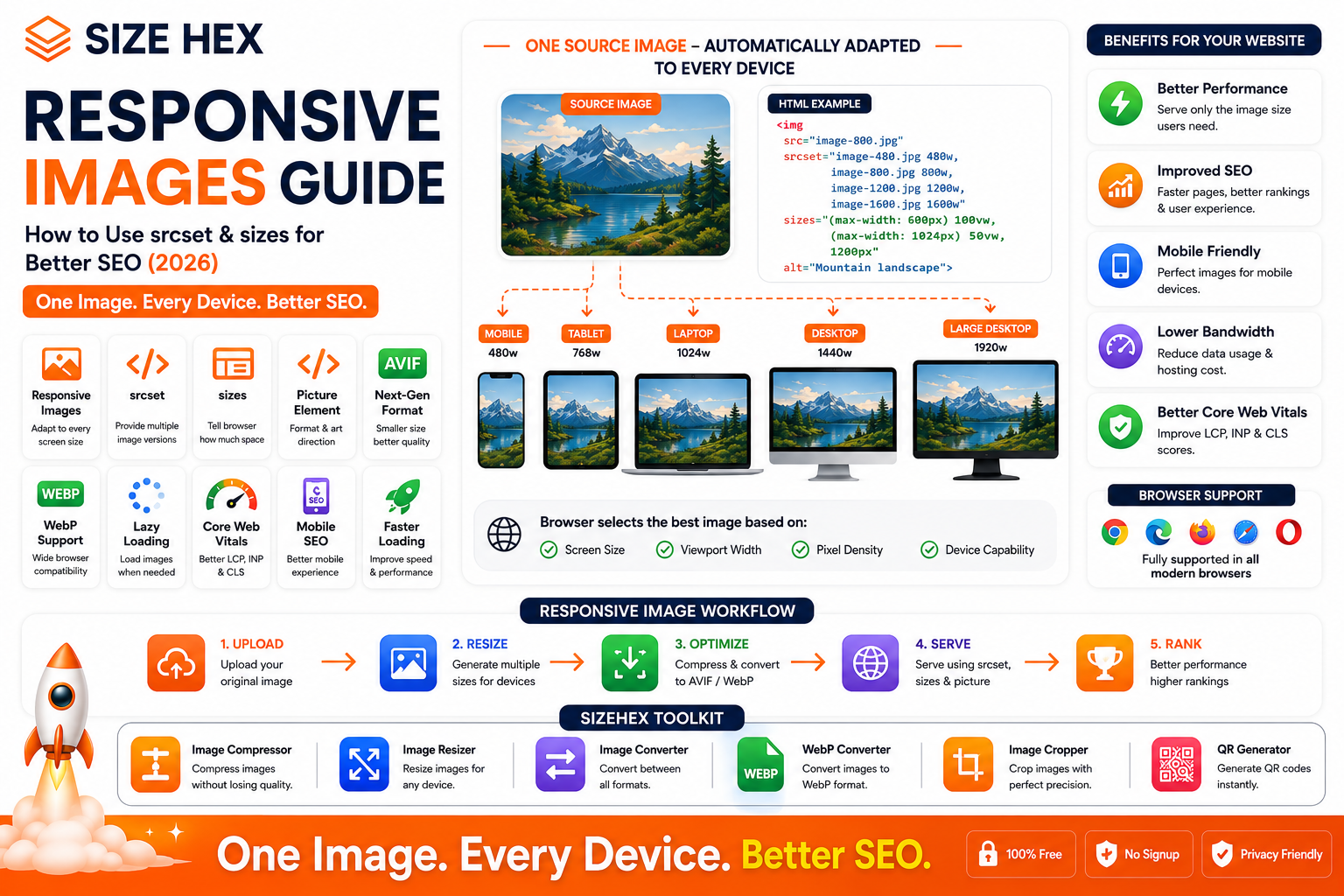
Responsive Images Guide: How to Use srcset & sizes for Better SEO (2026)
Modern websites are accessed from a wide variety of devices, including smartphones, tablets, laptops, and large desktop monitors. Each device has a different screen size, resolution, and network speed. If every visitor downloads the same large image, smaller devices waste bandwidth while larger devices may not always receive the best quality.
This is where responsive images become essential.
Responsive images allow browsers to automatically choose the most appropriate image size based on the user's device, screen resolution, and viewport. Instead of serving a single image to everyone, responsive images ensure each visitor receives an optimized version that balances quality and performance.
Responsive images are an important part of modern web development because they help reduce loading times, improve user experience, lower bandwidth consumption, and support Google's performance-focused metrics such as Core Web Vitals.
In this guide, you'll learn how responsive images work, how to use the srcset and sizes attributes, when to use the <picture> element, and how these techniques can improve your website's performance and support a strong image SEO strategy.
What Are Responsive Images?
Responsive images are images that automatically adapt to different screen sizes and device capabilities.
Rather than delivering one fixed image to every visitor, responsive images allow the browser to select the most suitable version.
For example:
- Desktop users may receive a 1600px image.
- Tablet users may receive an 800px image.
- Mobile users may receive a 480px image.
This ensures visitors download only the image size they actually need.
Why Responsive Images Matter
Many websites still upload a single large image for every device.
For example:
A homepage banner measuring 2400 × 1600 pixels may be displayed on a smartphone that's only 390 pixels wide.
The browser still downloads the large image even though it displays it at a much smaller size.
This results in:
- Slower page loading
- Higher mobile data usage
- Increased bandwidth costs
- Lower performance scores
- Poor user experience
Responsive images solve this problem by allowing browsers to choose the most appropriate file size.
How Responsive Images Work
Responsive images rely on HTML attributes that provide multiple versions of the same image.
When a page loads, the browser evaluates:
- Screen width
- Viewport size
- Pixel density (Retina displays)
- Device resolution
- Available layout space
It then downloads only the image that best matches those conditions.
This happens automatically without requiring users to choose anything.
Understanding srcset
The srcset attribute allows you to provide multiple versions of an image.
Each version is listed with its width descriptor.
Example:
<img
  src="image-800.jpg"
  srcset="
    image-480.jpg 480w,
    image-800.jpg 800w,
    image-1200.jpg 1200w"
  alt="Mountain Landscape">
Here, the browser can choose between:
- 480px image
- 800px image
- 1200px image
depending on the visitor's device and layout.
The browser makes the selection automatically.
Understanding sizes
The sizes attribute tells the browser how much space the image will occupy in different layouts.
Example:
<img
  src="image-800.jpg"
  srcset="
    image-480.jpg 480w,
    image-800.jpg 800w,
    image-1200.jpg 1200w"
  sizes="
    (max-width: 600px) 100vw,
    (max-width: 1024px) 50vw,
    800px"
  alt="Mountain Landscape">
In this example:
- On small screens, the image takes the full viewport width.
- On tablets, it takes about half the viewport width.
- On larger screens, it displays at approximately 800 pixels.
Providing accurate sizes information helps the browser download the most appropriate image, improving efficiency.
Understanding the <picture> Element
Sometimes, different devices require entirely different images instead of simply different sizes.
The <picture> element allows you to specify multiple image sources for different situations.
For example, you can:
- Serve AVIF to supported browsers.
- Fall back to WebP or JPG for others.
- Use a cropped mobile image while displaying a wider desktop image.
This technique is known as art direction.
The browser automatically selects the first compatible source.
Responsive Images vs Fixed Images
| Feature | Responsive Images | Fixed Images |
|---|---|---|
| Device Optimization | ✅ Yes | ❌ No |
| Mobile Performance | Excellent | Poor |
| Bandwidth Usage | Lower | Higher |
| Loading Speed | Faster | Slower |
| Core Web Vitals | Better | Often Worse |
| SEO Support | Excellent | Moderate |
| User Experience | Better | Less Efficient |
Responsive images provide a more efficient experience across a wide range of devices.
Benefits for SEO
Responsive images do not directly improve rankings, but they support many factors that contribute to a better search experience.
Benefits include:
- Faster page loading
- Improved mobile experience
- Reduced bandwidth usage
- Better Core Web Vitals
- Lower bounce rates
- Higher user satisfaction
- Improved crawl efficiency for image-heavy pages
Combined with descriptive filenames, alt text, image compression, and modern formats such as AVIF and WebP, responsive images strengthen an overall image SEO strategy.
Browser Support
Responsive image features such as srcset, sizes, and the <picture> element are supported by all major modern browsers, including:
- Google Chrome
- Microsoft Edge
- Mozilla Firefox
- Apple Safari
- Opera
- Android Browser
Older browsers that lack support generally fall back to the standard src attribute, helping maintain compatibility.
Common Myths About Responsive Images
Let's clear up some common misconceptions.
Myth 1: Responsive images automatically improve Google rankings.
Reality: They support SEO by improving performance and user experience, but they are not a direct ranking factor.
Myth 2: srcset alone is enough.
Reality: In many layouts, combining srcset with the sizes attribute gives the browser the information it needs to choose the most efficient image.
Myth 3: Responsive images only matter on mobile devices.
Reality: They benefit all screen sizes, including tablets, laptops, and high-resolution desktop displays.
Myth 4: The <picture> element is always required.
Reality: Many websites only need srcset and sizes. Use <picture> when you need different image formats or art direction.
Myth 5: Responsive images reduce image quality.
Reality: When implemented correctly, users receive an appropriately sized image that maintains excellent visual quality while avoiding unnecessary downloads.
Real-World Examples
Example 1: E-commerce Website
An online clothing store serves:
- 1600px product images for desktop.
- 800px images for tablets.
- 480px images for mobile devices.
Customers experience faster page loads while still seeing clear product photos.
Example 2: News Website
A news portal uses responsive featured images for articles.
Readers on slower mobile networks download smaller images, reducing loading times and improving readability.
Example 3: Photography Portfolio
A photographer serves high-resolution desktop galleries while delivering smaller responsive versions to smartphones.
Visitors enjoy a smooth browsing experience without sacrificing image quality.
Example 4: SaaS Website (SizeHex)
SizeHex uses responsive images across its homepage, blog posts, tool previews, tutorials, and comparison graphics.
Combined with AVIF, WebP, lazy loading, and image compression, responsive images help deliver faster pages, better Core Web Vitals, and a more consistent experience across desktop and mobile devices.
Key Takeaways
- Responsive images allow browsers to choose the most appropriate image for each device.
-
The
srcsetattribute provides multiple image sizes for the browser to choose from. -
The
sizesattribute describes how much layout space an image will occupy. -
The
<picture>element enables format switching and art direction when needed. - Responsive images reduce bandwidth usage, improve loading speed, and enhance user experience.
- While not a direct ranking factor, responsive images support SEO by improving performance and Core Web Vitals.
- Combining responsive images with AVIF, WebP, lazy loading, descriptive alt text, and proper image compression creates a strong foundation for modern image optimization.
Complete Responsive Images Guide
Now that you understand what responsive images are, let's learn how to implement them correctly and use them to improve website speed, user experience, and your overall SEO strategy.
1. Why Responsive Images Improve Website Speed
One of the biggest reasons websites load slowly is oversized images.
For example, imagine a blog uploads a 2400px hero image for every visitor.
Even if a smartphone only displays it at 390px, the browser still downloads the full-sized file unless responsive images are implemented.
This leads to:
- Longer loading times
- Increased mobile data usage
- More bandwidth consumption
- Slower rendering
Responsive images solve this problem by allowing browsers to download only the image size required for the visitor's screen.
Example
Device Image Downloaded Mobile 480px Tablet 768px Laptop 1200px Desktop 1600px Instead of wasting bandwidth, each visitor receives an optimized image.
2. Responsive Images & Core Web Vitals
Google evaluates page experience using Core Web Vitals.
Responsive images help improve several important metrics.
Largest Contentful Paint (LCP)
Large hero images often become the LCP element.
Serving an appropriately sized responsive image reduces download time, helping the main content appear sooner.
Interaction to Next Paint (INP)
Smaller image downloads reduce network activity, allowing the browser to remain more responsive during user interactions.
Cumulative Layout Shift (CLS)
Responsive images alone do not prevent layout shifts.
Always specify:
- Width
- Height
- Aspect ratio
This reserves layout space before the image loads.
3. Mobile Performance Benefits
Most website visitors now browse using smartphones.
Responsive images improve mobile performance by:
- Reducing download size
- Saving mobile data
- Loading faster on slower networks
- Improving battery efficiency
- Creating a smoother browsing experience
These improvements are particularly valuable for users on cellular connections.
4. Understanding
srcsetThe
srcsetattribute provides multiple versions of the same image.Example:
<img
  src="photo-800.jpg"
  srcset="
    photo-480.jpg 480w,
    photo-800.jpg 800w,
    photo-1200.jpg 1200w,
    photo-1600.jpg 1600w"
  alt="Mountain Landscape">
The browser automatically selects the most appropriate image based on the device's viewport and pixel density.
Benefits:
- Faster downloads
- Lower bandwidth
- Better image quality
- Improved responsiveness
5. Understanding
sizesThe
sizesattribute tells the browser how wide the image will appear in different layouts.Example:
<img
  src="photo-800.jpg"
  srcset="
    photo-480.jpg 480w,
    photo-800.jpg 800w,
    photo-1200.jpg 1200w"
  sizes="
    (max-width:600px) 100vw,
    (max-width:1024px) 50vw,
    800px"
  alt="Mountain Landscape">
This information allows the browser to select the most efficient image before downloading it.
Without an accurate
sizesattribute, the browser may choose a larger image than necessary.
6. Using the
<picture>ElementThe
<picture>element offers greater flexibility than a standard<img>tag.It allows you to:
- Serve AVIF first
- Fall back to WebP
- Fall back to JPG
- Use different image crops for mobile and desktop
Example:
<picture>
  <source srcset="hero.avif" type="image/avif">
  <source srcset="hero.webp" type="image/webp">
  <img src="hero.jpg" alt="Hero Banner">
</picture>
The browser selects the first supported image format automatically.
7. Art Direction vs Resolution Switching
These are two different responsive image techniques.
Resolution Switching
Uses the same image in different sizes.
Example:
- 480px
- 800px
- 1200px
- 1600px
Only the resolution changes.
Art Direction
Uses different versions of an image depending on the device.
Example:
Desktop:
- Wide landscape banner
Mobile:
- Cropped portrait version
Art direction improves composition across different screen sizes.
8. Responsive Images with AVIF & WebP
Responsive images work even better when combined with modern image formats.
Recommended order:
- AVIF
- WebP
- JPG (fallback)
Benefits include:
- Smaller downloads
- Faster rendering
- Better image quality
- Improved performance
This combination delivers excellent results on modern websites.
9. Lazy Loading + Responsive Images
Lazy loading delays image downloads until they approach the visible area of the page.
When combined with responsive images:
- Smaller files are downloaded.
- Fewer images load initially.
- Initial page rendering becomes faster.
- Mobile users consume less data.
This combination is especially effective for image-heavy pages.
10. CDN Optimization
A Content Delivery Network (CDN) stores copies of your images on servers around the world.
Many modern CDNs can:
- Resize images automatically
- Convert images to AVIF or WebP
- Compress images
- Cache optimized versions
- Deliver images from the nearest server
This reduces latency and improves global performance.
11. WordPress Support
WordPress includes built-in support for responsive images.
Many themes and plugins automatically generate multiple image sizes and add the necessary
srcsetinformation.Popular optimization plugins can also:
- Convert images to AVIF
- Generate WebP
- Enable lazy loading
- Compress uploads
- Integrate with CDNs
Always test your site after enabling image optimization features.
12. Responsive Images in HTML
Modern HTML makes responsive images straightforward.
A typical implementation includes:
-
<img> -
src -
srcset -
sizes -
loading="lazy" -
width -
height -
alt
Combining these attributes creates fast, accessible, and responsive images.
13. Common SEO Mistakes
Avoid these mistakes.
❌ Uploading one large image for every device
❌ Missing
sizes❌ Incorrect
srcset❌ No width and height attributes
❌ Missing alt text
❌ Generic filenames
❌ Not compressing images
❌ Ignoring mobile testing
❌ Not using modern formats
❌ Forgetting browser fallbacks
14. Responsive Image Best Practices
Follow these recommendations.
- Resize images before uploading.
- Use descriptive filenames.
- Add meaningful alt text.
- Enable lazy loading.
- Combine AVIF and WebP with fallback formats.
- Specify width and height.
- Test on multiple devices.
- Keep original image files.
- Monitor Core Web Vitals.
- Review performance after updates.
15. Testing Responsive Images
After implementation, verify:
- Mobile loading speed
- Desktop loading speed
- Correct image selection
- Visual quality
- Browser compatibility
- Core Web Vitals
- PageSpeed Insights results
Regular testing helps maintain performance as your site evolves.
16. Responsive Images for E-commerce
Online stores often display hundreds of product images.
Responsive images help by:
- Loading category pages faster
- Improving mobile shopping
- Reducing bandwidth
- Increasing perceived performance
This contributes to a smoother shopping experience.
17. Responsive Images for Blogs
Blogs typically include:
- Featured images
- Screenshots
- Infographics
- Tutorial images
Serving appropriately sized versions improves readability and reduces page weight.
18. Responsive Images for Portfolios
Creative portfolios often showcase high-resolution work.
Responsive images ensure visitors receive images that match their device while preserving quality.
This is particularly valuable for photographers, designers, and artists.
19. Troubleshooting
If responsive images are not working correctly:
-
Check the
srcsetsyntax. -
Verify the
sizesattribute. - Confirm image paths.
- Test on multiple devices.
- Clear browser and CDN caches.
- Inspect the selected image in browser developer tools.
These steps resolve many common implementation issues.
20. Complete Responsive Images Checklist
Task Status Multiple Image Sizes Generated ✅ srcsetAdded✅ sizesConfigured✅ <picture>Used Where Needed✅ AVIF/WebP Enabled ✅ Width & Height Set ✅ Lazy Loading Enabled ✅ Alt Text Added ✅ Descriptive Filenames Used ✅ Performance Tested ✅ Core Web Vitals Reviewed ✅ Mobile Devices Tested ✅
Pro Tips
- Generate image sizes based on your site's layout rather than creating unnecessary variants.
-
Use the
<picture>element when you need both modern format support and art direction. - Pair responsive images with AVIF or WebP, lazy loading, and a CDN for the best performance.
- Audit your largest pages regularly to ensure oversized images aren't slowing them down.
- Re-test PageSpeed Insights and Core Web Vitals after major design or content updates to verify continued improvements.
Advanced Responsive Image Strategies, FAQs & Publishing Checklist
You've now learned what responsive images are, how
srcsetandsizeswork, and how to implement them correctly. In this final section, we'll cover advanced optimization techniques, common mistakes, frequently asked questions, and a complete publishing checklist to help you maximize website performance and support your overall SEO strategy.Responsive images work best when combined with modern image formats like AVIF and WebP, lazy loading, image compression, descriptive alt text, fast hosting, and a well-structured website.
Before Publishing Checklist
Before publishing a webpage that uses responsive images, review the following checklist.
Images
✅ High-quality original images
✅ Multiple image sizes generated
✅ Correct aspect ratio maintained
✅ Optimized file formats (AVIF/WebP)
SEO
✅ Descriptive filenames
Example:
responsive-images-seo-guide.avif✅ Meaningful alt text
✅ Proper image captions (when useful)
Performance
✅
srcsetimplemented✅
sizesconfigured correctly✅ Lazy loading enabled
✅ Width & height specified
Technical SEO
✅ HTTPS enabled
✅ Images crawlable by search engines
✅ Image Sitemap updated
✅ No broken image URLs
Testing
✅ Mobile devices tested
✅ Tablet tested
✅ Desktop tested
✅ PageSpeed Insights reviewed
✅ Core Web Vitals checked
Advanced Responsive Image Strategies
1. Generate Multiple Image Sizes
Instead of uploading only one image, generate several optimized versions.
Example:
- 320px
- 480px
- 768px
- 1024px
- 1440px
- 1920px
This allows browsers to choose the most appropriate version.
2. Use Modern Formats First
Recommended priority:
- AVIF
- WebP
- JPG (fallback)
Modern browsers receive highly compressed images, while older browsers continue to receive compatible formats.
3. Use the
<picture>Element for Art DirectionSometimes mobile users should see a different crop instead of a smaller version.
Example:
Desktop:
Wide landscape banner
Mobile:
Portrait-focused crop
The
<picture>element makes this possible.
4. Optimize Hero Images
Hero images often become the Largest Contentful Paint (LCP) element.
Ensure they are:
- Responsive
- Compressed
- Served in AVIF or WebP
- Properly sized
This can significantly improve loading performance.
5. Combine Responsive Images with Lazy Loading
Lazy loading prevents below-the-fold images from downloading until needed.
Benefits include:
- Faster initial rendering
- Reduced bandwidth
- Better mobile experience
- Improved page responsiveness
6. Use a CDN
Modern CDNs can automatically:
- Resize images
- Compress images
- Convert to AVIF/WebP
- Cache optimized versions
- Deliver from nearby servers
This improves performance for visitors around the world.
7. Audit Images Regularly
As your website grows, review image performance periodically.
Look for:
- Oversized files
- Unused images
- Missing responsive variants
- Slow-loading pages
Regular audits help maintain consistent performance.
Common Responsive Image Mistakes
Avoid these common issues.
❌ Uploading only one large image
❌ Missing
srcset❌ Incorrect
sizesvalues❌ Forgetting width and height attributes
❌ No lazy loading
❌ Missing alt text
❌ Generic filenames
❌ Ignoring browser compatibility
❌ Using unnecessarily large dimensions
❌ Never testing on real devices
Frequently Asked Questions (FAQ)
1. What are responsive images?
Responsive images allow browsers to select the most appropriate image size based on the visitor's device and screen size.
2. What is
srcset?srcsetprovides multiple image files so the browser can choose the best one for the current display.
3. What is the
sizesattribute?The
sizesattribute tells the browser how much layout space the image is expected to occupy, helping it choose the most suitable file fromsrcset.
4. What is the
<picture>element?The
<picture>element allows you to serve different image formats or different image crops depending on browser support or device requirements.
5. Do responsive images improve SEO?
Not directly. They improve loading speed and user experience, which can support an effective SEO strategy.
6. Do responsive images improve Core Web Vitals?
Yes. Properly implemented responsive images can help improve metrics such as Largest Contentful Paint (LCP) by reducing image download sizes.
7. Can I use responsive images with AVIF?
Yes.
This is one of the best modern image optimization strategies.
8. Can I combine responsive images with WebP?
Yes.
Many websites serve AVIF first, WebP second, and JPG as a fallback.
9. Do WordPress websites support responsive images?
Yes.
WordPress automatically generates multiple image sizes and adds
srcsetfor uploaded images in many cases.
10. Should every image be responsive?
Most content images, hero banners, blog featured images, and product images benefit from responsive delivery.
11. Is lazy loading still necessary?
Yes.
Responsive images and lazy loading complement each other and address different performance concerns.
12. Do responsive images reduce bandwidth?
Yes.
Visitors download only the image size they need, reducing unnecessary data transfer.
13. Can responsive images improve mobile performance?
Yes.
Smaller downloads lead to faster loading and lower data usage on mobile devices.
14. Which image format works best with responsive images?
AVIF and WebP are excellent choices for modern browsers, with JPG used as a fallback where needed.
15. Which tool should I use to prepare responsive images?
A browser-based tool like SizeHex can help resize, compress, and convert images into modern formats before implementation.
Conclusion
Responsive images are an essential part of modern web development. Instead of serving the same large image to every visitor, they ensure each device receives an appropriately sized image that balances quality and performance.
By combining
srcset,sizes, and the<picture>element with modern image formats like AVIF and WebP, you can reduce page weight, improve loading speed, and create a better experience for users across desktops, tablets, and smartphones.Although responsive images are not a direct Google ranking factor, they contribute to better Core Web Vitals, lower bandwidth usage, and improved usability—making them a valuable component of a comprehensive image SEO strategy.
Why Choose SizeHex?
SizeHex helps you prepare images for modern, high-performance websites with fast, browser-based tools.
Features
- Resize images for every screen size
- Compress images without noticeable quality loss
- Convert between AVIF, WebP, JPG, PNG, GIF, BMP, and TIFF
- Crop images with precision
- Fast browser-based processing
- No software installation required
- Privacy-friendly image processing
Whether you're a blogger, web developer, designer, photographer, digital marketer, or business owner, SizeHex makes it easy to create responsive, SEO-friendly images.
Related Tools
Image Compressor
Reduce image file size while maintaining quality.
Image Resizer
https://www.sizehex.com/image-resizer.html
Generate optimized image sizes for different devices.
Image Converter
https://www.sizehex.com/image-converter.html
Convert images between popular formats, including AVIF and WebP.
WebP Converter
https://www.sizehex.com/webp-converter.html
Convert images to the WebP format for better performance.
Image Cropper
https://www.sizehex.com/image-crop.html
Crop images accurately for desktop and mobile layouts.
QR Generator
https://www.sizehex.com/qr-generator.html
Create QR codes instantly for websites, products, and marketing materials.