August 14, 2026
Image Compression SEO Guide (2026): How Image Compression Improves Website Performance
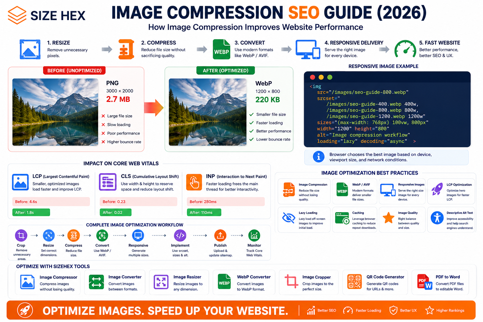
Image Compression, SEO, Page Speed & Core Web Vitals
If you've ever opened a website on a slow mobile connection and watched a huge image load one piece at a time, you've already experienced the problem image optimization is supposed to solve.
Images make websites look better.
They explain products, demonstrate software, improve blog content, and make pages more engaging.
But they can also become some of the largest files a browser has to download.
According to Google's web.dev documentation, images often account for a large portion of the bytes downloaded by a webpage, so optimizing them can produce significant performance improvements.
This is where image compression becomes important.
The goal isn't simply to make every image as small as possible.
The real goal is:
Reduce unnecessary bytes while keeping the image visually useful and appropriate for the device displaying it.
And that's where image compression connects with SEO, page speed, user experience, and Core Web Vitals.
What Is Image Compression?
Image compression is the process of reducing the amount of data required to store and deliver an image.
For example, imagine you have an original image:
Original: 2.8 MB
After optimization:
Compressed: 420 KB
The visual appearance may remain very similar, but the browser has significantly fewer bytes to download.
That can matter a lot when the image is being loaded over a mobile network.
Why Does Image Compression Matter for SEO?
Image compression isn't a magic Google ranking trick.
Compressing an image doesn't mean:
"Google will automatically rank my page higher."
Instead, compression can contribute to a faster and better user experience.
Google's Image SEO documentation recommends applying modern image optimization and responsive-image techniques to provide a high-quality and fast user experience. Google also notes that images are often one of the largest contributors to overall page size.
And performance matters because users don't experience your website as HTML code.
They experience:
Click → Loading → Content appears → Page becomes usable
If your main image takes too long to download, the page can feel slow even when the rest of your code is optimized.
1. Large Images Can Slow Down Your Website
Consider a simple webpage containing:
HTML → 40 KBCSS → 80 KBJavaScript → 180 KBImages → 4.5 MB
The images are responsible for most of the transferred data.
Now imagine reducing those images:
HTML → 40 KBCSS → 80 KBJavaScript → 180 KBImages → 1.2 MB
You've dramatically reduced the amount of data the browser needs to download.
This is why web.dev describes image optimization as an area that can produce some of the largest byte savings and performance improvements on image-heavy pages.
2. Image Compression and Core Web Vitals
This is where things become especially interesting for SEO.
Google's Core Web Vitals are designed to measure important aspects of real-world user experience.
One of those metrics is:
Largest Contentful Paint (LCP)
LCP measures how quickly the largest visible content element is rendered.
That element can be:
- An image
- A video poster image
- A large text block
If your hero image becomes the LCP element, its loading performance can directly affect the page's LCP.
web.dev recommends aiming for an LCP of 2.5 seconds or less at the 75th percentile for a good user experience.
3. How Compression Can Help LCP
Imagine your hero image is:
3.2 MB
The browser has to download that resource before it can render the image.
Now suppose you optimize it to:
650 KB
There are fewer bytes to transfer.
That can reduce the image's resource load duration.
web.dev specifically explains that reducing the size of an image that is an LCP candidate can reduce its resource load duration and potentially improve LCP.
However, there's an important catch:
Compression alone doesn't guarantee a better LCP.
4. LCP Is More Than Image File Size
Suppose you compress your hero image from:
2 MB → 400 KB
but the image is only discovered after JavaScript executes.
You may still have a slow LCP.
Why?
Because the browser can't start downloading the image early enough.
web.dev explains that LCP performance depends on multiple stages, including resource discovery, resource priority, resource load duration, and rendering.
So a better strategy is:
Compress the image
Make it discoverable early
Give the critical image appropriate priority
Avoid delaying the LCP image
5. Never Automatically Lazy-Load Your LCP Image
Lazy loading is useful.
But applying it to the wrong image can hurt performance.
For example:
<imgsrc="hero-image.webp"loading="lazy"alt="Website performance illustration">
If this is the page's LCP image, delaying its loading isn't ideal.
web.dev explicitly recommends not lazy-loading the LCP image, because doing so can introduce unnecessary resource-load delay.
Lazy loading is much more appropriate for images that are below the initial viewport.
6. Compression vs Image Quality
This is one of the biggest challenges.
You don't want:
Huge file ❌
But you also don't want:
Tiny file + terrible quality ❌
The goal is:
Small file + acceptable visual quality ✅
web.dev describes image optimization as a balance involving factors such as format, image content, quality, and pixel dimensions.
For example:
Original
2.5 MBHigh quality
Over-compressed
90 KBVisible artifacts
Optimized
350 KBGood visual quality
The third option is often the practical target.
7. Lossy vs Lossless Compression
There are two important concepts you'll encounter when compressing images.
Lossy Compression
Lossy compression removes some information from the image to achieve a smaller file size.
Examples can include JPEG and lossy WebP/AVIF encoding.
Advantages:
- Much smaller files
- Excellent for photographs
- Useful for web delivery
Disadvantage:
- Excessive compression can reduce visual quality
Lossless Compression
Lossless compression reduces file size without discarding image information.
The original data can be reconstructed.
It's useful when preserving exact image information matters.
The trade-off is that lossless compression may not achieve the same file-size reduction as aggressive lossy compression.
8. JPEG Compression
JPEG is still widely used, particularly for photographs.
For example:
Original JPEG↓Resize↓Compress↓Optimized JPEG
A large photographic image can often be significantly reduced without an obvious visual difference when appropriate quality settings are chosen.
But JPEG isn't always the best choice for every image.
9. PNG Compression
PNG is useful when you need:
- Transparency
- Sharp graphics
- Screenshots
- UI elements
- Certain illustrations
However, PNG can become unnecessarily large when used for photographic images.
For example, if you have a photograph saved as a huge PNG, converting it to a more suitable format may produce a much smaller file.
The right format depends on the content.
10. WebP Compression
WebP is one of the modern formats worth considering for websites.
web.dev notes that modern formats such as WebP and AVIF can provide better compression than older formats such as JPEG and PNG in many situations.
For example:
photo.jpg
could potentially become:
photo.webp
with a significantly smaller file size while maintaining good visual quality.
WebP supports both lossy and lossless compression and supports transparency.
11. AVIF Compression
AVIF is another modern image format.
It can provide very efficient compression in appropriate use cases.
web.dev notes that AVIF can achieve substantial savings compared with JPEG in some tests, although browser support and workflow considerations should still be considered.
A modern image workflow might therefore look like:
Original↓Resize↓Generate WebP / AVIF↓Compare visual quality↓Choose the appropriate output
Don't automatically convert every image to AVIF without testing the result.
12. Image Dimensions Matter Too
Compression isn't the only thing that determines file size.
Pixel dimensions matter.
Imagine you have an image:
6000 × 4000 pixels
but your website displays it at:
800 × 533 pixels
You're potentially sending far more pixels than the visitor needs.
Instead, create an appropriately sized version.
For example:
1200 × 800
for a large desktop display.
And perhaps:
600 × 400
for smaller contexts.
Responsive images can allow browsers to choose an appropriate image candidate based on the user's device and display conditions. web.dev notes that serving desktop-sized images to mobile devices can use significantly more data than necessary.
13. Compression and Responsive Images Work Together
Consider:
<imgsrc="image-800.webp"srcset="image-400.webp 400w,image-800.webp 800w,image-1200.webp 1200w"sizes="100vw"alt="Image compression example">
Now the browser can select an appropriate candidate.
Instead of forcing a mobile user to download the largest desktop image, the browser can choose a smaller version when appropriate.
This can reduce unnecessary data transfer and can help when the image is an LCP candidate.
14. Don't Compress Everything to the Same Percentage
A common beginner mistake is:
"I'll compress every image by 80%."
That's not how image optimization should work.
Different images behave differently.
A photograph might compress extremely well.
A screenshot containing text may show artifacts much sooner.
A logo may require lossless treatment.
An illustration may have completely different requirements.
The optimal settings depend on:
- Image format
- Image dimensions
- Image content
- Compression method
- Quality target
- Intended display size
web.dev emphasizes that choosing compression settings involves multiple dimensions rather than one universal setting.
15. Real Before-and-After Example
Imagine a blog featured image:
Before
Format: PNGDimensions: 2400 × 1600File size: 2.4 MB
After optimization:
Format: WebPDimensions: 1200 × 800File size: 180 KB
That's a huge reduction.
The visitor receives substantially fewer bytes while still getting an appropriately sized image.
The important lesson is that the improvement didn't come from compression alone.
It came from:
Correct dimensions
Appropriate format
Compression
16. Image Compression Doesn't Mean "Make It Tiny"
This distinction is important.
The goal isn't:
"What's the smallest file I can create?"
The goal is:
"What's the smallest file I can deliver while maintaining appropriate visual quality and usability?"
For a thumbnail:
100 KB
might be perfectly reasonable.
For a large high-resolution photograph:
100 KB
might be too aggressive.
There is no universal file-size number that works for every image.
17. Image Compression on Mobile
Mobile users often experience different network conditions and device capabilities than desktop users.
Sending a massive desktop image to a mobile device wastes bandwidth.
Responsive images help solve this by allowing the browser to select a suitable image candidate. web.dev notes that serving desktop-sized images to mobile devices can use 2–4× more data than necessary in some situations.
That's why a modern workflow should consider:
Desktop↓Tablet↓Mobile
rather than delivering one huge image to everyone.
18. Compression Is Only One Part of Image SEO
This is perhaps the most important takeaway from this entire article.
You can have perfectly compressed images and still have a poorly optimized website.
Image SEO includes:
- Descriptive filenames
- Useful alt text
- Relevant page context
- Appropriate dimensions
- Image compression
- Modern formats
- Responsive images
- Correct loading behavior
- Crawlable image URLs
- Image sitemaps where appropriate
- Good visual quality
Google's Image SEO documentation treats image quality, speed, discoverability, and the image's landing page as interconnected parts of image optimization.
19. A Simple Image Optimization Workflow
For most websites, a practical workflow looks like this:
Original Image↓Check Dimensions↓Resize if Necessary↓Choose Appropriate Format↓Compress↓Check Visual Quality↓Generate Responsive Sizes↓Add Descriptive Filename↓Write Useful Alt Text↓Publish
For SizeHex users, the process can be even simpler:
Resize → Compress → Convert → Publish
20. The SizeHex Approach
This is where an image optimization toolkit becomes useful.
Instead of opening multiple applications, you can prepare an image through a simple browser-based workflow.
For example:
Step 1
Resize the image to the dimensions you actually need.
Step 2
Compress it to reduce unnecessary bytes.
Step 3
Convert it to a suitable modern format when appropriate.
Step 4
Use the optimized image on your website.
This turns image optimization from a technical task into a repeatable publishing workflow.
Key Takeaways From Part 1
Image compression is not simply about making files smaller.
It's about creating the right balance between:
File Size
Image Quality
Dimensions
Format
Loading Performance
Google recommends optimizing images for both speed and quality, while web.dev explains that image compression can reduce resource load duration and potentially improve LCP when an image is the LCP candidate.
The strongest workflow is:
Resize → Choose the right format → Compress → Serve the right size → Load it correctly
And remember:
Don't compress your images blindly. Optimize them intelligently.
Advanced Strategy, Mistakes, FAQs & Complete Publishing Checklist
By now, we have covered the basics of image compression, responsive images, modern formats, lazy loading, LCP, caching, and responsive delivery.
But there's one bigger idea to understand:
Image optimization is not one action. It's a complete system.
A website can have compressed images and still be slow if it serves the wrong dimensions, delays critical images, uses inefficient loading, or sends unnecessarily large assets to mobile users.
The best strategy combines compression + dimensions + format + delivery + loading behavior.
Advanced Image Compression SEO Strategy
49. Start With Dimensions, Not Compression
One of the easiest mistakes is taking a huge image and immediately compressing it.
Instead, ask:
Does the website actually need this many pixels?
For example:
Original4000 × 30003.2 MB
But your article displays it at:
800 × 600
A better workflow is:
4000 × 3000↓1200 × 900↓WebP↓Compress
This can eliminate unnecessary pixels before compression even begins.
Responsive image techniques are specifically recommended for serving appropriately sized images to different devices.
50. Don't Optimize Images in Isolation
Suppose your image is only 100 KB.
That sounds great.
But if it is:
- 4000px wide
- loaded above the fold
- discovered late
- rendered through JavaScript
- missing dimensions
- unnecessarily preloaded
you can still have a performance problem.
Look at the complete journey:
Image URL↓Discovery↓Download↓Decode↓Render
Optimizing only the file size addresses only part of that process.
web.dev explains that LCP performance depends on resource discovery, resource load duration, resource priority, and rendering—not simply the number of kilobytes in the file.
51. Optimize the LCP Image First
If you're trying to improve a slow page, don't necessarily start by optimizing the smallest images at the bottom of the page.
Find the LCP element first.
If it's a hero image, focus on:
- Correct dimensions
- Compression
- Modern format
- Early discovery
- Appropriate priority
- No unnecessary lazy loading
web.dev recommends avoiding lazy loading for the LCP image because delaying it can increase its load time.
52. Use Lazy Loading Strategically
For images below the fold:
loading="lazy"
can be useful.
For a critical hero image:
loading="lazy"
may be counterproductive.
A simple strategy is:
Above the fold→ Load normally / prioritize when appropriateBelow the fold→ Consider lazy loading
Don't blindly apply one rule to every image.
53. Use srcset for Multiple Image Sizes
A strong implementation might look like:
<imgsrc="/images/seo-guide-800.webp"srcset="/images/seo-guide-400.webp 400w,/images/seo-guide-800.webp 800w,/images/seo-guide-1200.webp 1200w"sizes="(max-width: 768px) 100vw, 800px"width="1200"height="800"alt="Image compression workflow">
This gives the browser several options instead of forcing every visitor to download the largest image.
Responsive images are particularly valuable for mobile performance.
54. Use the Right Format for the Image
Don't choose formats based purely on popularity.
Think about the content.
Photograph
JPEG / WebP / AVIF
Transparent graphic
PNG / WebP / AVIF
Modern web image
WebP / AVIF
Logo or vector icon
SVG
The best format depends on the visual and your browser-support/delivery requirements.
55. WebP Is Not Automatically Better
Converting:
photo.png
to:
photo.webp
doesn't guarantee that the image is properly optimized.
You should still check:
- Dimensions
- Quality
- File size
- Visual artifacts
A poorly optimized WebP can still be unnecessarily large.
56. Compression Quality Should Be Tested Visually
Don't only look at:
Before: 1.8 MBAfter: 120 KB
Also look at:
- Text clarity
- Edges
- Faces
- Gradients
- Fine details
- Transparency
- Compression artifacts
For a website, visual quality still matters.
A 50 KB image that looks terrible isn't a successful optimization.
57. Use Different Compression Settings for Different Images
A photograph might work well at one quality setting.
A screenshot may need another.
For example:
Photo→ stronger compressionUI screenshot→ moderate compressionLogo→ lossless / appropriate vector format
There is no universal quality percentage that should be applied to every image.
58. Don't Compress Logos Like Photographs
A logo often contains:
- Flat colors
- Sharp edges
- Text
- Transparent backgrounds
Aggressive lossy compression can introduce visible artifacts around letters and edges.
For logos, SVG or an appropriate lossless format may be preferable depending on the asset.
59. Don't Send a 4K Image to a 300px Component
Imagine a card:
Displayed width:300px
But the website sends:
4000px image
That's unnecessary.
Create appropriately sized candidates.
For example:
300px600px900px
and let responsive image logic select the appropriate one.
60. Compression and Browser Caching Solve Different Problems
Compression reduces the size of the resource.
Caching reduces how often the browser needs to download it again.
For example:
First visit
300 KB → Download
Repeat visit
Cached → Reuse
A properly configured cache can therefore complement image compression.
61. Use an Image CDN When Your Site Needs One
An image CDN can automate parts of image delivery.
Depending on the service, it may provide:
- Automatic resizing
- Format conversion
- Compression
- Caching
- Geographic delivery
For a small static website, this may not be necessary.
For a large e-commerce website or media-heavy platform, it can become very useful.
62. Don't Preload Every Image
Preloading tells the browser that a resource is important.
That means you shouldn't preload everything.
If you preload:
20 images
you've essentially told the browser:
"Everything is critical."
That defeats the purpose.
Preload should generally be reserved for genuinely important resources, such as a critical responsive hero image when appropriate. web.dev recommends using preload carefully for important resources.
63. Don't Lazy-Load Above-the-Fold Images
This mistake is common because developers hear:
"Lazy loading improves performance."
The complete statement is:
Lazy loading can improve performance when used on images that don't need to load immediately.
A critical hero/LCP image is different.
So:
Hero image→ Don't unnecessarily lazy-loadArticle images far below the fold→ Lazy loading can be appropriate
64. Add Width and Height
For images where dimensions are known, include them:
<imgsrc="image.webp"width="1200"height="800"alt="Image optimization workflow">
This allows the browser to reserve the appropriate space and helps reduce unexpected layout movement.
The aspect ratio should correspond to the actual image.
65. Don't Forget Accessibility
Compression is a performance task.
Alt text is an accessibility and image-understanding task.
Don't replace:
alt="Image compression workflow"
with nothing just because the image has been optimized.
A fast image should still be understandable to users who cannot see it.
66. Don't Forget Image SEO
A technically optimized image should still have:
- Descriptive filename
- Useful alt text
- Relevant page context
- Appropriate dimensions
- Good visual quality
- Crawlable URL
Google's image guidance considers filenames, alt text, page context, image quality, and discoverability as parts of understanding and surfacing images.
67. A Complete Image Optimization Workflow
Here's the workflow I'd recommend for a modern website:
Original Image↓Check Dimensions↓Resize↓Choose Format↓Compress↓Generate Responsive Sizes↓Choose Loading Strategy↓Add Width + Height↓Write Alt Text↓Use Descriptive Filename↓Publish↓Monitor Performance
That's much more powerful than simply running an image through a compressor.
68. SizeHex Publishing Workflow
For a SizeHex blog image, the practical workflow can be:
Step 1 — Crop
Remove unnecessary areas.
Step 2 — Resize
Set the image to a reasonable display size.
Step 3 — Compress
Reduce file size while preserving quality.
Step 4 — Convert
Use WebP when appropriate.
Step 5 — Rename
Use a descriptive filename.
Step 6 — Add Alt Text
Describe the image naturally.
Step 7 — Publish
Use the appropriate HTML implementation.
This makes SizeHex useful not only as a standalone tool but as part of a complete image-publishing workflow.
69. SizeHex Tools You Can Use
🖼️ Image Compressor
Use it to reduce image file size before uploading to your website. SizeHex Image Compressor
🔄 Image Converter
Convert between JPG, PNG, and WebP formats directly in your browser. SizeHex Image Converter
📐 Image Resizer
Resize images to exact pixel dimensions before publishing. SizeHex Image Resizer
⚡ WebP Converter
Convert supported images to WebP and control the conversion quality. SizeHex WebP Converter
✂️ Image Cropper
Crop images and use preset aspect ratios such as 1:1, 16:9, 4:5, and 9:16. SizeHex Image Cropper
QR Code Generator
Generate static QR codes for URLs, Wi-Fi, text, and other supported data types. SizeHex QR Code Generator
Common Image Compression Mistakes
Mistake 1: Compressing Without Resizing
A 4000px image doesn't become efficient simply because you reduced its quality.
Mistake 2: Using PNG for Everything
PNG isn't the right choice for every photograph.
Mistake 3: Converting Everything to WebP
Format selection should depend on the image and delivery requirements.
Mistake 4: Lazy-Loading the LCP Image
This can delay the image that matters most to initial page rendering.
Mistake 5: Serving One Huge Image Everywhere
Use responsive images when different screen sizes need different image dimensions.
Mistake 6: Compressing Until Quality Is Destroyed
The smallest possible file isn't necessarily the best result.
Mistake 7: Ignoring Mobile
A desktop-sized image can waste a significant amount of mobile bandwidth.
Mistake 8: Forgetting Alt Text
Image optimization doesn't replace accessibility.
Mistake 9: Missing Image Dimensions
Known dimensions should generally be supplied to help the browser reserve layout space.
Mistake 10: Preloading Everything
Preload only genuinely important resources.
20 Frequently Asked Questions
1. Does image compression improve SEO?
Compression itself isn't a guaranteed ranking boost. It can improve page performance and user experience, which are important parts of modern web optimization.
2. Does Google prefer WebP?
Google supports WebP, but there isn't a simple rule that every image must be WebP. Choose the format that provides an appropriate balance of quality, size, and compatibility.
3. Is AVIF better than WebP?
Not universally. AVIF can offer excellent compression, but the best format depends on the image and your delivery workflow.
4. What is a good image file size for SEO?
There is no universal KB limit. The goal is to serve the smallest appropriate file that maintains sufficient quality for its display size.
5. Should I compress every image?
Images intended for web delivery should generally be optimized, but the appropriate method depends on the image type.
6. Does compression improve LCP?
It can. If the compressed image is the LCP resource, reducing its resource load duration can help. But discovery and loading priority also matter.
7. Should I lazy-load every image?
No. Lazy loading is generally more appropriate for images below the initial viewport. Critical LCP images should not be unnecessarily lazy-loaded.
8. Should hero images be compressed?
Yes. Hero images should be optimized carefully because they can be among the most important resources on the page.
9. Should I resize images before compressing them?
Usually, yes. Remove unnecessary pixel dimensions before spending effort on compression.
10. Is JPEG still useful?
Yes. JPEG remains useful for many photographic images.
11. Is PNG good for websites?
Yes, particularly when transparency or certain lossless graphics are required. It isn't ideal for every photographic image.
12. Does WebP reduce image size?
It can. WebP often provides smaller files than comparable JPEG or PNG images, depending on the image and encoding settings.
13. Should I use responsive images?
For many websites, yes. Responsive images allow the browser to choose a more appropriate resource for the user's display conditions.
14. What is srcset?
srcset provides multiple image candidates so the browser can select an appropriate version.
15. What is sizes?
sizes tells the browser how much space the image is expected to occupy under different layout conditions.
16. Can caching improve image performance?
Yes. Browser caching can reduce repeated downloads of resources that have already been cached.
17. Should I use an image CDN?
It can be useful for larger or image-heavy websites, but smaller websites may not need one.
18. Does compression affect image quality?
It can. Lossy compression may introduce visible artifacts if applied too aggressively.
19. Can I automate image compression?
Yes. Build pipelines and image-processing systems can automatically resize, convert, compress, and generate responsive variants.
20. What is the best image optimization strategy?
A strong general workflow is:
Resize → Choose format → Compress → Generate responsive sizes → Load appropriately → Add descriptive metadata → Monitor performance.
Before-Publishing Image SEO Checklist
Image
- ✅ Correct dimensions
- ✅ Appropriate format
- ✅ Compressed
- ✅ Visually acceptable quality
SEO
- ✅ Descriptive filename
- ✅ Useful alt text
- ✅ Relevant surrounding content
- ✅ Appropriate image URL
Performance
- ✅ Responsive image candidates where useful
-
✅ Correct
srcset -
✅ Correct
sizes - ✅ LCP image isn't unnecessarily lazy-loaded
- ✅ Below-the-fold images can use lazy loading
- ✅ Browser caching configured appropriately
Technical
- ✅ Width and height available
- ✅ Image is crawlable
-
✅ HTML
<img>implementation - ✅ Image sitemap considered where useful
Real Before & After Example
Imagine a blog featured image starts as:
Format: PNGDimensions: 3000 × 2000File size: 2.7 MB
After optimization:
Format: WebPDimensions: 1200 × 800File size: 220 KB
Then the HTML could be:
<imgsrc="/images/image-compression-seo-800.webp"srcset="/images/image-compression-seo-400.webp 400w,/images/image-compression-seo-800.webp 800w,/images/image-compression-seo-1200.webp 1200w"sizes="(max-width: 768px) 100vw, 800px"width="1200"height="800"alt="Image compression workflow for website performance">
Now you've addressed several optimization areas at once:
Dimensions
→ Format
→ Compression
→ Responsive Delivery
→ Accessibility
→ Image Context
Related SizeHex Articles
This blog belongs to the larger SizeHex Image SEO cluster.
Google Images Ranking Factors Guide
How Google discovers and understands images.
Image Structured Data & Schema Guide
How structured data can provide additional image context.
Image File Naming SEO Guide
How to create descriptive and scalable image filenames.
Image Alt Text SEO Guide
How to write useful alt text for Google and accessibility.
Image Licensing & Copyright SEO Guide
Understanding image usage rights and copyright considerations.
Image Preloading & fetchpriority Guide
Understanding image loading priority and critical resources.
Browser Caching for Images Guide
How caching can reduce repeated image downloads.
Conclusion
Image compression isn't about making every image as tiny as possible.
It's about delivering the right visual quality at the lowest practical cost in bytes.
A strong image optimization strategy looks like this:
Resize
↓
Choose the right format
↓
Compress
↓
Generate responsive versions
↓
Load images appropriately
↓
Cache reusable assets
↓
Add descriptive filename + alt text
↓
Monitor real-world performance
Google and web.dev both emphasize that image performance depends on more than compression alone. Appropriate dimensions, responsive delivery, loading behavior, and resource prioritization all matter.
The simplest rule to remember is:
Don't send users more image data than they actually need.
That's the foundation of good image performance.
Why SizeHex?
SizeHex brings several common image-preparation tasks into one browser-based toolkit.
You can resize, compress, convert, crop, and convert images to WebP before publishing them online. The tools are designed to process supported image tasks directly in the browser.
Prepare the image → Optimize it → Publish it.