August 22, 2026
Image Dimensions SEO: How Width & Height Affect Website Speed & CLS (2026 Guide)
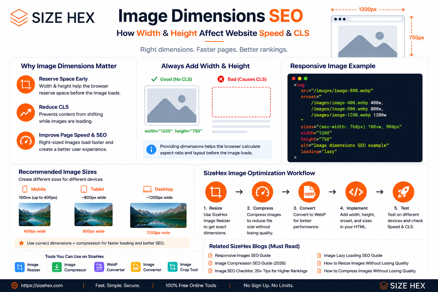
Image Dimensions SEO: How Width & Height Affect Website Speed & CLS
Images are an important part of almost every modern website.
They make blog posts easier to understand, help product pages look more attractive, and make landing pages more engaging.
But there is one technical detail that developers often overlook:
Image dimensions.
Uploading a large image and simply letting CSS resize it may make the image look fine on the screen, but the browser still needs information about the image's dimensions and aspect ratio.
If that information is missing, the browser may not reserve the correct amount of space before the image loads.
That can cause content to move while the page is loading.
This is known as Cumulative Layout Shift (CLS).
What Are Image Dimensions?
Image dimensions are the intrinsic width and height of an image.
For example:
1200 × 800 pixels
means:
Width  = 1200px
Height = 800px
The image has an aspect ratio of:
1200 : 800
or:
3 : 2
These dimensions are part of the image itself, but developers can also provide them directly in HTML.
For example:
<img
  src="/images/example.webp"
  width="1200"
  height="800"
  alt="Example image"
>
The width and height attributes tell the browser the image's intrinsic dimensions and help it determine the appropriate aspect ratio before the image finishes loading.
Why Do Image Dimensions Matter for SEO?
Image dimensions aren't a direct ranking factor by themselves.
The important connection is performance and layout stability.
Consider a blog page with this structure:
Article heading
↓
Featured image
↓
Paragraph
↓
More content
When the browser doesn't know how much space the image needs, it may initially render:
Article heading
↓
Paragraph
↓
More content
and then, once the image loads:
Article heading
↓
Large image
↓
Paragraph moves down
↓
More content moves down
The user sees the page suddenly shift.
That's a poor experience.
Providing the image's dimensions gives the browser information it can use to reserve the correct aspect-ratio space before the image is loaded.
What Is CLS?
CLS stands for Cumulative Layout Shift.
It measures unexpected movement of visible page content while a page is loading.
Imagine you're about to click a button:
Download
but an image loads above it and pushes the button downward.
You click.
But instead of the button, you accidentally click something else.
That's exactly the type of frustrating experience that layout stability is intended to address.
Images without reserved dimensions are one common cause of layout shifts.
A Common Image Implementation Problem
You might see code like this:
<img
  src="/images/blog-image.webp"
  alt="Image optimization guide"
>
The image may work perfectly.
But the browser doesn't have explicit width and height information in the HTML.
A better implementation is:
<img
  src="/images/blog-image.webp"
  width="1200"
  height="800"
  alt="Image optimization guide"
>
Now the browser knows the image's intended aspect ratio.
Does width="1200" Mean the Image Will Always Be 1200px Wide?
No.
This is a very common misunderstanding.
You can still make the image responsive with CSS:
img {
  max-width: 100%;
  height: auto;
}
Suppose the original image is:
1200 × 800
On desktop it might appear:
900 × 600
and on mobile:
360 × 240
The HTML attributes still provide the intrinsic dimensions:
width="1200"
height="800"
while CSS controls how large the image actually appears in the layout.
Image Dimensions vs Image File Size
These are two completely different things.
Image dimensions
Example:
1200 × 800 px
This describes the image's pixel dimensions.
File size
Example:
145 KB
This describes how much storage/data the file occupies.
You can have:
1200 × 800
with a file size of:
150 KB
or:
2 MB
depending on the format, compression level and image content.
So:
Reducing dimensions does not automatically mean the image is properly compressed.
And:
Compressing an image does not automatically mean its dimensions are appropriate.
Both need to be considered.
Why Large Images Can Hurt Performance
Suppose your website displays an image at:
400px wide
but the original file is:
4000px wide
The browser may still download a very large resource even though the page only displays it at 400px.
That is inefficient.
A better approach is to create an image closer to the actual requirements of the layout.
For example:
Mobile → 400px
Tablet → 800px
Desktop → 1200px
This is where image resizing and responsive-image techniques work together.
SizeHex's Image Resizer, for example, allows users to resize JPG, PNG and WebP images to exact pixel dimensions.
Image Dimensions and Responsive Images
Image dimensions are not a replacement for responsive images.
They solve different problems.
width + height
Help the browser understand:
What is the image's intrinsic aspect ratio?
srcset + sizes
Help the browser decide:
Which image resource should I download?
For example:
<img
  src="/images/image-800.webp"
  srcset="
    /images/image-400.webp 400w,
    /images/image-800.webp 800w,
    /images/image-1200.webp 1200w
  "
  sizes="(max-width: 768px) 100vw, 900px"
  width="1200"
  height="800"
  alt="Responsive image example"
>
Here:
srcset + sizes
→ resource selection

width + height
→ intrinsic dimensions / aspect ratio
Using these techniques together gives the browser more useful information about the image.
What Image Dimensions Should You Use?
There is no single image size that is correct for every website.
The right dimensions depend on:
- Where the image appears
- How wide the container is
- The device
- The image's purpose
- The required visual quality
For a typical SizeHex blog article, a large featured image might use:
1200 × 750
with responsive variants such as:
400 × 250
800 × 500
1200 × 750
But the exact values should be based on the actual layout.
Don't Upload Huge Images Just Because They Look Better
A common workflow is:
Camera / Design software
        ↓
4000 × 3000 image
        ↓
Upload directly to website
        ↓
CSS displays it at 700px
The result may look good.
But you're potentially sending far more image data than the page requires.
A better workflow is:
Original
   ↓
Determine required display size
   ↓
Resize
   ↓
Compress
   ↓
Create responsive variants
   ↓
Implement with HTML
This reduces unnecessary work for the browser and the user's connection.
Image Dimensions Are Part of a Bigger Optimization Strategy
Good image optimization isn't one single technique.
It is a combination of:
Correct dimensions
        +
Appropriate format
        +
Compression
        +
Responsive delivery
        +
Correct loading strategy
        +
Good accessibility
For example, an image can have perfect dimensions but still be unnecessarily large because of poor compression.
Another image can be highly compressed but still be 4000px wide when the page only needs 800px.
That's why image optimization needs to be treated as a complete process.
A Practical Example
Imagine a SizeHex blog featured image:
Original:
2400 × 1600
The blog layout displays it at around:
Desktop:
900px wide
and:
Mobile:
390px wide
Instead of using only the 2400px image, create useful variants:
400 × 267
800 × 533
1200 × 800
Then implement them with responsive HTML.
This gives the browser both:
resource choices
and:
intrinsic dimension information.
The Important Rule
Don't ask:
“What is the biggest image I can upload?”
Ask:
“What is the largest size this image actually needs to be displayed at?”
Then create appropriate variants around that requirement.
This is especially important for image-heavy websites, blogs, e-commerce stores and web applications.
What We'll Implement on SizeHex
For SizeHex, this topic connects directly with the image optimization workflow we've already established.
For important blog images:
Original
   ↓
Determine actual display width
   ↓
Resize
   ↓
Compress
   ↓
Create responsive variants
   ↓
Add width + height
   ↓
Use srcset + sizes
   ↓
Test CLS + performance
The objective isn't simply to make the image smaller.
It's to make sure the browser receives the right information and an appropriately sized resource.
Related SizeHex Tool
When you need to create the correct pixel dimensions before adding an image to a website, you can use the SizeHex Image Resizer. It supports JPG, PNG and WebP images and allows exact dimensions to be specified.
How to Implement Image Dimensions Correctly
Knowing that image dimensions matter is only the first step.
The important question is:
How should you actually write the HTML and CSS so the image remains responsive without causing unnecessary layout shifts?
The good news is that you don't need complicated JavaScript for this. Modern browsers already understand image dimensions, aspect ratios, srcset, and sizes.
1. The Basic HTML Implementation
A basic image can be written like this:
<img
  src="/images/example.webp"
  width="1200"
  height="800"
  alt="Image optimization example"
>
The important part is:
width="1200"
height="800"
These values describe the image's intrinsic dimensions.
The browser can use them to calculate the image's aspect ratio before the image itself finishes loading. This allows it to reserve the appropriate amount of space and helps reduce layout shifts.
2. Make the Image Responsive With CSS
Adding width and height does not mean the image has to appear at 1200px × 800px on every device.
You can still use:
img {
  max-width: 100%;
  height: auto;
}
Now imagine the original image is:
1200 × 800
It could appear as:
Desktop → 900 × 600
Tablet  → 700 × 467
Mobile  → 360 × 240
The browser maintains the aspect ratio while CSS controls the displayed size.
3. Don't Set Only Width and Forget Height
A common pattern is:
<img
  src="/images/example.webp"
  width="1200"
  alt="Example image"
>
This doesn't provide the browser with the complete intrinsic aspect-ratio information.
Prefer:
<img
  src="/images/example.webp"
  width="1200"
  height="800"
  alt="Example image"
>
Providing both dimensions lets the browser calculate the aspect ratio before the image loads.
4. Don't Guess the Dimensions
The values should match the actual image.
If the actual file is:
1200 × 750
don't write:
width="1200"
height="800"
unless the image is intentionally being presented with a different aspect ratio.
Incorrect dimensions can result in an incorrect reserved space and can cause the image to be displayed incorrectly or require additional layout adjustments.
Use the image's actual intrinsic dimensions.
5. Image Dimensions Don't Reduce File Size
This is extremely important.
Adding:
width="400"
height="250"
doesn't turn a 2 MB image into a 100 KB image.
Suppose the original file is:
4000 × 2500
2 MB
and you write:
width="400"
height="250"
The browser still has to download the original 2 MB file.
You've only told the browser how the image should be displayed.
So there are two separate jobs:
Image dimensions
→ layout stability

Image resizing/compression
→ resource size
Both matter.
6. Resize the Actual Image When Necessary
If an image is displayed at around 400px wide, but the source is 4000px wide, consider creating a more appropriate source.
For example:
Original
4000px
   ↓
Resize
   ↓
400px / 800px / 1200px
This is especially useful when the image is used in different layouts.
You can use the SizeHex Image Resizer to create exact image dimensions.
The important distinction is:
HTML dimensions control layout information; resizing controls the actual pixel resource.
7. Combine Dimensions With srcset
For a responsive website, you can combine both techniques.
For example:
<img
  src="/images/blog-image-800.webp"
  srcset="
    /images/blog-image-400.webp 400w,
    /images/blog-image-800.webp 800w,
    /images/blog-image-1200.webp 1200w
  "
  sizes="(max-width: 768px) 100vw, 900px"
  width="1200"
  height="750"
  alt="Image optimization guide"
>
Now the browser has two different kinds of information.
width + height
1200 × 750
→ aspect ratio / layout space
srcset
400w
800w
1200w
→ available image resources
sizes
Mobile → 100vw
Desktop → 900px
→ expected display width
The browser can use these hints to choose an appropriate image resource.
8. Why sizes Must Match Your Layout
Consider:
sizes="(max-width: 768px) 100vw, 900px"
You're telling the browser:
Mobile:
Image ≈ viewport width

Desktop:
Image ≈ 900px
If your actual desktop image is only 700px wide, then 900px isn't an accurate description.
Instead:
sizes="(max-width: 768px) 100vw, 700px"
would better describe that layout.
MDN notes that sizes describes the intended rendered width and is used with width descriptors in srcset when the browser selects an image candidate.
9. Don't Use sizes With 2x
There are two different srcset approaches.
Width descriptors
srcset="
  image-400.webp 400w,
  image-800.webp 800w,
  image-1200.webp 1200w
"
Use:
sizes="..."
Pixel-density descriptors
srcset="
  image.webp 1x,
  image-2x.webp 2x
"
Here, sizes isn't used in the same way.
For fluid blog images, the first pattern is generally the more useful one.
10. srcset Doesn't Mean “Mobile = Small Image”
The browser doesn't simply follow:
Mobile → 400px
Desktop → 1200px
It considers the information you've provided along with factors such as viewport size and device pixel density when selecting a candidate.
So your job is to provide good candidates and accurate layout information.
The browser makes the final selection.
11. The sizes Order Matters
Consider:
sizes="
  (max-width: 768px) 100vw,
  (max-width: 1200px) 80vw,
  900px
"
The browser evaluates the conditions in order.
The first matching condition is used.
Therefore, don't write a broad condition before a more specific one if it would prevent the intended condition from being reached.
12. Use <picture> When You Need a Different Image
Sometimes responsive sizing isn't enough.
Imagine:
Desktop:
Wide image

Mobile:
Different crop
This is an art direction problem.
You can use <picture>:
<picture>

  <source
    media="(max-width: 768px)"
    srcset="/images/hero-mobile.webp"
  >

  <img
    src="/images/hero-desktop.webp"
    width="1200"
    height="630"
    alt="SizeHex online tools"
  >

</picture>
The mobile and desktop images can have different compositions while still representing the same subject.
13. <picture> Can Also Handle Image Formats
Another use case is format selection:
<picture>

  <source
    srcset="/images/image.avif"
    type="image/avif"
  >

  <source
    srcset="/images/image.webp"
    type="image/webp"
  >

  <img
    src="/images/image.jpg"
    width="1200"
    height="800"
    alt="Image optimization example"
  >

</picture>
The <source> elements provide alternative resources, while the <img> remains the fallback.
14. CSS aspect-ratio Can Also Help
CSS provides another way to explicitly control an element's aspect ratio.
For example:
.blog-image {
  width: 100%;
  aspect-ratio: 3 / 2;
  object-fit: cover;
}
This can be useful when you intentionally want a consistent visual container.
But don't use aspect-ratio as an excuse to ignore the actual image dimensions.
For ordinary <img> elements, providing accurate width and height attributes is still a strong baseline because the browser can use those dimensions early during page rendering.
15. object-fit and Image Cropping
Suppose your design requires every blog card image to have the same visual shape.
You might use:
.blog-card img {
  width: 100%;
  aspect-ratio: 16 / 9;
  object-fit: cover;
}
This makes the image fill the defined area while maintaining its aspect ratio.
But remember:
object-fit
→ controls visual presentation

srcset
→ controls resource selection

width + height
→ provides intrinsic dimensions
These solve different problems.
16. Don't Stretch Images
Avoid:
img {
  width: 100%;
  height: 300px;
}
if the original aspect ratio doesn't match the forced dimensions.
You could end up with a stretched or distorted image.
Instead, use:
img {
  width: 100%;
  height: auto;
}
or, when intentional cropping is required:
img {
  width: 100%;
  aspect-ratio: 16 / 9;
  object-fit: cover;
}
Maintaining an appropriate aspect ratio is important for responsive layouts and visual stability.
17. Don't Lazy-Load Everything
You may see developers adding:
loading="lazy"
to every image.
That's not always the right approach.
For images that are far below the initial viewport, lazy loading can be useful.
But for an important above-the-fold image, especially an LCP image, you should evaluate whether delaying its loading is actually beneficial.
The loading strategy should depend on the image's position and importance rather than being applied blindly.
18. A Good SizeHex Blog Image
For a large SizeHex blog image, a practical implementation could look like:
<img
  src="/images/image-800.webp"
  srcset="
    /images/image-400.webp 400w,
    /images/image-800.webp 800w,
    /images/image-1200.webp 1200w
  "
  sizes="(max-width: 768px) 100vw, 900px"
  width="1200"
  height="750"
  alt="Image dimensions and responsive image optimization"
>
This gives the browser:
Intrinsic ratio
       ↓
1200 × 750

Available resources
       ↓
400 / 800 / 1200

Expected display size
       ↓
100vw / 900px
That's a much more complete implementation than simply writing:
<img src="huge-image.webp">
19. A Common Mistake on Real Websites
Consider this:
<img
  src="/images/hero-4000.webp"
  width="400"
  height="250"
  alt="Hero image"
>
At first glance it looks optimized because the HTML says:
400 × 250
But the actual file is:
4000 × 2500
So you're still downloading a huge image.
The correct approach is:
Resize actual source
        ↓
Create suitable variants
        ↓
Compress
        ↓
Use srcset
        ↓
Provide width + height
This distinction is extremely important.
20. The Complete Technical Pattern
For a typical responsive content image:
<img
  src="/images/article-800.webp"
  srcset="
    /images/article-400.webp 400w,
    /images/article-800.webp 800w,
    /images/article-1200.webp 1200w
  "
  sizes="(max-width: 768px) 100vw, 900px"
  width="1200"
  height="750"
  alt="Descriptive alternative text"
>
And CSS:
img {
  max-width: 100%;
  height: auto;
}
This combination covers the main requirements:
width + height
→ layout information

srcset
→ image candidates

sizes
→ expected display width

CSS
→ responsive presentation
21. How to Check Whether It Is Working
Don't stop after writing the HTML.
Open Chrome DevTools:
Network → Img
Then test the page at different viewport sizes.
Look at:
- Which image file was requested
- File size
- Display dimensions
- Loading timing
- Whether the page shifts while loading
You can also use Lighthouse or PageSpeed Insights to evaluate the resulting page performance.
The important thing is to verify real browser behavior, not just the code.
22. What This Means for SizeHex
For SizeHex, the practical rule should be:
Large image
Check its actual display width.
Image too large
Resize it.
Multiple layouts
Create multiple candidates.
Responsive image
Use:
srcset + sizes
Different crop
Use:
picture
Layout stability
Use:
width + height
Below-the-fold image
Consider:
loading="lazy"
Important above-the-fold image
Test its loading priority instead of automatically lazy-loading it.
23. The Simple Rule to Remember
If you remember only one thing from this part, remember this:
Tell the browser how much space the image needs, and give it appropriately sized image resources to choose from.
That means:
width + height
        +
srcset + sizes
        +
responsive CSS
These techniques complement each other; they aren't competing solutions.
Related SizeHex Tool
If you need to create the correct pixel dimensions before implementing responsive images, use:
SizeHex Image Resizer — resize JPG, PNG and WebP images to exact dimensions.
Practical Image Dimensions SEO Implementation for SizeHex
Understanding image dimensions is useful, but the real value comes from implementing them correctly.
For SizeHex, the goal is to create images that match the actual layout, avoid unnecessarily large files, maintain layout stability, and connect image optimization with the rest of the site's SEO structure.
1. Start With Your Most Important Images
You don't need to modify every image on SizeHex at once.
Start with:
Blog featured images
These are usually among the largest images on an article page.
Large article graphics
Examples include:
- Technical diagrams
- Tutorials
- Comparison graphics
- Infographics
Tool screenshots
Large screenshots used to explain SizeHex tools should also be reviewed.
Hero images
Large above-the-fold images deserve special attention because they can affect the page's loading performance and LCP.
Small icons and decorative images can be handled later.
2. Recommended Image Sizes for SizeHex
For large blog images, use these as a practical starting point:
| Image Version | Recommended Width |
|---|---|
| Mobile | 400px |
| Tablet | 800px |
| Desktop | 1200px |
For a 3:2 image, that could mean:
400 × 267
800 × 533
1200 × 800
For a 16:10 image:
400 × 250
800 × 500
1200 × 750
The important rule is:
Keep the original aspect ratio.
Do not force every SizeHex image into the same dimensions.
3. Create the Required Variants
Suppose your original blog image is:
2400 × 1600
Instead of using the same 2400px file everywhere, create useful variants:
400 × 267
800 × 533
1200 × 800
For SizeHex, you can use the Image Resizer to create these exact dimensions.
The live SizeHex toolkit currently includes Image Resizer alongside Image Compressor, Image Converter, WebP Converter, Image Crop Tool, PDF to Word and HEIC to JPG.
4. Compress the Generated Images
Creating smaller dimensions doesn't automatically mean the files are small.
After resizing, optimize the resulting images.
Use the SizeHex Image Compressor:
For example:
1200 × 800 image
        ↓
Compression
        ↓
Smaller file size
        ↓
Better web delivery
The current SizeHex compressor supports JPG, PNG and WebP.
5. Create WebP Versions
When WebP is appropriate for the image, create WebP versions of your responsive variants.
For example:
image-400.webp
image-800.webp
image-1200.webp
Now the browser has multiple image resources available.
6. Add width and height
Once the image is ready, add its actual dimensions to the HTML.
For example:
<img
  src="/images/image-1200.webp"
  width="1200"
  height="800"
  alt="Image dimensions SEO example"
>
If the actual image is 1200 × 800, use exactly:
width="1200"
height="800"
Don't use random values.
The purpose is to give the browser accurate intrinsic dimension information so it can determine the image's aspect ratio before the resource finishes loading.
7. Combine Dimensions With srcset
For responsive SizeHex blog images, combine intrinsic dimensions with responsive image candidates:
<img
  src="/images/image-800.webp"
  srcset="
    /images/image-400.webp 400w,
    /images/image-800.webp 800w,
    /images/image-1200.webp 1200w
  "
  sizes="(max-width: 768px) 100vw, 900px"
  width="1200"
  height="800"
  alt="Image dimensions SEO example"
>
This provides three different types of information:
width + height
→ intrinsic aspect ratio

srcset
→ available image candidates

sizes
→ expected rendered width
This is the recommended pattern for a fluid content image.
8. Featured Image Implementation
For this article, a suitable featured-image setup would be:
1200 × 750
with:
400 × 250
800 × 500
1200 × 750
Then:
<img
  src="/images/image-dimensions-seo-800.webp"
  srcset="
    /images/image-dimensions-seo-400.webp 400w,
    /images/image-dimensions-seo-800.webp 800w,
    /images/image-dimensions-seo-1200.webp 1200w
  "
  sizes="(max-width: 768px) 100vw, 900px"
  width="1200"
  height="750"
  alt="Image dimensions SEO guide"
>
The 900px value should be adjusted if the actual SizeHex article container is narrower or wider.
9. Large Screenshots
Large screenshots can follow the same approach.
For example:
Original:
2400px+

Responsive:
400px
800px
1200px
Implementation:
<img
  src="/images/sizehex-image-resizer-800.webp"
  srcset="
    /images/sizehex-image-resizer-400.webp 400w,
    /images/sizehex-image-resizer-800.webp 800w,
    /images/sizehex-image-resizer-1200.webp 1200w
  "
  sizes="(max-width: 768px) 100vw, 900px"
  width="1200"
  height="800"
  alt="SizeHex Image Resizer showing image dimensions"
  loading="lazy"
>
For genuinely below-the-fold screenshots, lazy loading can be appropriate.
For an important above-the-fold image, evaluate loading behavior before adding loading="lazy".
10. Don't Optimize Every Image the Same Way
A 1200px blog illustration and a 100px icon don't need the same treatment.
For SizeHex:
Large images
→ responsive variants

Medium images
→ appropriate dimensions + compression

Small icons
→ simple optimized assets

Decorative graphics
→ optimize according to actual usage
This keeps the implementation practical.
11. Don't Create Too Many Variants
You don't need:
320
360
375
390
400
480
600
768
900
1024
1200
1440
1600
for every image.
Start with:
400
800
1200
Then add another candidate only if the actual SizeHex layout or performance testing shows a meaningful benefit.
12. Don't Fake Dimensions
Avoid this:
<img
  src="/images/huge-image.webp"
  width="400"
  height="250"
  alt="Example"
>
when the actual source is:
4000 × 2500
The HTML attributes don't resize the actual file.
The browser may still download the large 4000px resource.
Instead:
Original
   ↓
Resize actual image
   ↓
Compress
   ↓
Create responsive variants
   ↓
srcset + sizes
   ↓
width + height
13. Internal Linking: Connect This Article to Existing SizeHex Content
This is where this article becomes part of the larger SizeHex SEO structure.
The live SizeHex Blog currently contains several directly related articles.
Responsive Images SEO Guide
This is the most closely related article.
Link it when explaining:
-
srcset -
sizes - responsive image candidates
Use natural anchor text such as:
responsive images
Image Compression SEO Guide
Link this where the article explains that dimensions and compression solve different problems.
Natural anchor:
image compression
Image Lazy Loading SEO Guide
Link this in the section discussing:
loading="lazy"
Natural anchor:
lazy loading images
Image SEO Checklist
Link this when explaining that dimensions are only one part of complete image SEO.
Natural anchor:
image SEO checklist
How to Resize Images Without Losing Quality
This is particularly relevant to the practical resizing workflow.
Natural anchor:
resize images without losing quality
How to Compress Images Without Losing Quality
Link this from the compression section.
Natural anchor:
compress images without losing quality
The live Blog page confirms these articles are already published on SizeHex.
Important: the current public blog index exposes the article links internally, but the web text extraction does not expose their individual destination URLs. So I'm linking to the verified /blog page rather than inventing individual slugs. When inserting the links through your Admin editor, select the corresponding published article from your actual blog URLs.
14. Related SizeHex Tools
For this article, keep the tool links tightly relevant.
Image Resizer
Use it to create the 400px, 800px and 1200px variants.
Image Compressor
Use it to reduce the file size after resizing.
WebP Converter
Use it to create WebP versions of the image variants.
These tools directly support the workflow described in this article. The current SizeHex homepage confirms all three are part of the live toolkit.
15. Recommended Internal Linking Structure
The article should connect like this:
              Image Dimensions SEO
                       │
          ┌────────────┼────────────┐
          ↓            ↓            ↓
    Image Resizer   Compressor   WebP Converter
          │            │            │
          └────────────┼────────────┘
                       ↓
              Responsive Images
                       ↓
                Image SEO
                       ↓
             Image SEO Checklist
This creates a useful relationship between tool pages and informational content instead of adding random internal links.
16. Practical SizeHex Workflow
For an actual SizeHex blog image:
Original Image
      ↓
Check displayed width
      ↓
Create 400 / 800 / 1200 variants
      ↓
Compress variants
      ↓
Create WebP versions
      ↓
Add width + height
      ↓
Add srcset + sizes
      ↓
Choose loading strategy
      ↓
Test mobile
      ↓
Test desktop
      ↓
Check PageSpeed / Lighthouse
This is the workflow you should follow for important images across SizeHex.
17. How to Check the Result
After implementing the changes:
Chrome DevTools
Open:
Network → Img
Test:
- Mobile viewport
- Tablet viewport
- Desktop viewport
Check:
- Which image was downloaded
- Image file size
- Loading time
- Display dimensions
Lighthouse / PageSpeed
Check:
- LCP
- CLS
- Properly sized images
- Image delivery
- Overall performance
The objective isn't simply to have responsive-image markup.
The objective is to make sure the actual browser behavior improves.