August 21, 2026
JPG vs PNG vs WebP vs AVIF: Which Image Format Is Best for SEO & Website Speed in 2026?
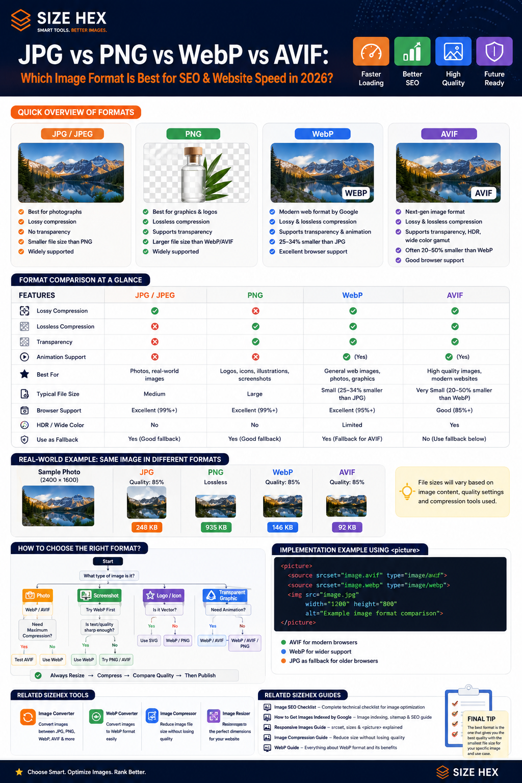
Choosing an image format isn't just about whether the image “looks good.”
The format you choose affects file size, loading time, image quality, transparency, browser compatibility, and ultimately how efficiently your website delivers visual content. Images are often among the heaviest resources on a webpage, so choosing an efficient format can reduce the amount of data a browser needs to download.
That's why there isn't one format that is automatically best for every image.
The better question is:
Which format makes the most sense for this particular image?
JPG, PNG, WebP and AVIF: The Basic Difference
Before comparing them, let's understand what each format is designed to do.
| Format | Best Known For | Transparency | Compression |
|---|---|---|---|
| JPG / JPEG | Photographs | ❌ | Lossy |
| PNG | Graphics & transparency | ✅ | Lossless |
| WebP | Modern web images | ✅ | Lossy + Lossless |
| AVIF | Very efficient modern images | ✅ | Lossy + Lossless |
Modern formats such as WebP and AVIF can provide smaller files than JPEG or PNG in many situations, which can reduce download time and potentially improve metrics such as LCP.
But that doesn't mean you should convert every single image on your website to AVIF.
The image itself matters.
What Is JPG?
JPG, or JPEG, is one of the most widely used image formats on the web.
It's particularly suitable for photographs and images containing lots of colors and visual detail.
For example:
Camera photo↓Landscape↓Travel photograph↓Product photograph
JPG uses lossy compression, which means some image information is discarded to reduce the file size.
For photographs, this can work extremely well because small compression artifacts may not be noticeable when the image contains lots of detail.
When JPG Makes Sense
JPG can still be a perfectly reasonable choice when:
- You need broad compatibility
- You're working with photographs
- Transparency isn't required
- The image is already well optimized
- You need a fallback format
For example:
Photo.jpg
can still be perfectly usable on a modern website.
The goal isn't to eliminate JPG simply because newer formats exist.
The goal is to deliver the most appropriate resource for the situation.
What Is PNG?
PNG is designed around lossless compression and is particularly useful when preserving exact image information matters.
It's commonly used for:
- Logos
- Interface graphics
- Screenshots
- Icons
- Illustrations
- Images requiring transparency
For example:
Logo↓Transparent background↓PNG
PNG supports transparency and lossless compression, which makes it useful for certain types of graphics.
However, PNG files can become significantly larger than modern alternatives when used for photographs or complex images.
That's why you shouldn't automatically use PNG for every image simply because the quality is excellent.
What Is WebP?
WebP was developed as a modern image format for the web.
One of its biggest advantages is that it supports both:
lossy compression
and
lossless compression
while also supporting transparency.
Google's WebP documentation reports that WebP lossless images can be around 26% smaller than comparable PNGs, while lossy WebP images can be roughly 25–34% smaller than comparable JPEGs at equivalent quality, though actual results depend on the image and encoding settings.
That makes WebP a very useful general-purpose format for modern websites.
Why WebP Is So Popular
Imagine you have this JPEG:
image.jpg250 KB
After converting and optimizing it, you might get:
image.webp150 KB
The exact reduction isn't guaranteed.
Some images may shrink dramatically.
Others may barely change.
That's why you should compare the actual output, rather than assuming WebP will always be a specific percentage smaller.
WebP is now natively supported by major browsers including Chrome, Safari, Firefox, Edge and Opera.
What Is AVIF?
AVIF is a newer image format based on the AV1 video codec.
Its major attraction is high compression efficiency.
In many cases, AVIF can produce a smaller file than JPEG or WebP while maintaining comparable visual quality. web.dev notes that AVIF supports both lossy and lossless compression and can offer substantial savings compared with JPEG in some tests.
AVIF also supports features such as:
- Transparency
- Wide color gamut
- HDR
- Lossy compression
- Lossless compression
That makes it technically very powerful.
So Is AVIF Automatically Better Than WebP?
Not necessarily.
This is where image optimization gets interesting.
Imagine:
JPEG200 KBWebP150 KBAVIF120 KB
AVIF looks like the winner.
But now imagine encoding takes significantly longer, or the visual quality isn't as good for a particular image at the same file size.
The answer can change.
Image optimization is about finding the right balance between:
file size + quality + encoding complexity + browser support + actual use case.
web.dev specifically recommends measuring the impact and finding a reasonable balance rather than generating excessive numbers of image variants.
Lossy vs Lossless: What Does It Actually Mean?
This is one of the most important concepts when choosing an image format.
Lossy compression
Some information is discarded.
Original↓Compression↓Smaller file↓Some information removed
Formats such as JPG, WebP and AVIF can use lossy compression.
It's often very effective for photographs because tiny differences aren't always noticeable.
Lossless compression
The image data can be reconstructed without losing the original pixel information.
Original↓Lossless compression↓Smaller file↓Original image data preserved
PNG, WebP and AVIF support lossless compression.
Lossless isn't automatically “better.”
If a photograph can be reduced from 1 MB to 150 KB with excellent visual quality using lossy compression, that may be the more practical choice for a website.
Why Image Format Matters for SEO
The format itself isn't a magic Google ranking factor.
You don't rank higher simply because:
image.webp
instead of:
image.jpg
The SEO benefit is more indirect.
A more efficient image can mean:
Smaller file↓Less data transferred↓Faster resource loading↓Better page performance↓Potentially better user experience
web.dev specifically notes that modern image formats can reduce resource load time and may improve LCP when they reduce the amount of data required.
So the right way to think about it is:
Image format supports performance; performance supports the overall page experience.
Not:
“WebP automatically gives me an SEO ranking boost.”
A Format Should Match the Image
This is the biggest rule we'll use throughout this guide.
Don't ask:
“Which format is best?”
Ask:
“Which format is best for this image?”
For example:
Photograph
JPGWebPAVIF
WebP or AVIF may be excellent modern choices.
Transparent logo
PNGWebPSVG
Depending on the asset, WebP or SVG may be more efficient than PNG.
Simple illustration
SVGWebPPNG
The correct choice depends on whether the artwork is vector-based or raster-based.
Screenshot
PNGWebPAVIF
WebP can often provide a useful balance between quality and file size.
What About SizeHex Images?
This matters particularly for a website like SizeHex because your content naturally contains:
- Tool screenshots
- Blog featured images
- UI illustrations
- Before/after comparisons
- Tool interface graphics
- Logos
These don't all need the same format.
For example:
Blog photograph→ WebP / AVIFTool screenshot→ WebP / AVIFTransparent graphic→ WebP / PNG / SVGLogo→ SVG / WebP / PNG depending on use
The important thing is to evaluate the actual image rather than creating one universal rule.
One More Important Point: Quality Still Matters
Imagine two files:
WebP80 KBBlurry textPNG250 KBCrystal-clear text
You shouldn't automatically choose the 80 KB file.
If the image contains important text or UI details, excessive compression can make it difficult to read.
web.dev recommends experimenting with compression levels to find a suitable balance between visual quality and file size because there isn't one universal compression setting that works for every image.
That's especially relevant for screenshots and UI images.
The Real Goal
Don't think:
JPG → WebP
and stop there.
Think:
Choose appropriate format↓Resize to required dimensions↓Compress appropriately↓Check visual quality↓Serve efficiently
The format is only one part of image optimization.
A Simple Rule to Remember
If you're unsure where to start:
Photos: consider WebP or AVIF.
Graphics requiring exact detail/transparency: consider PNG, WebP, AVIF, or SVG depending on the asset.
Modern general-purpose web images: WebP is a strong default.
Maximum compression: test AVIF against WebP rather than assuming one will always win.
Legacy compatibility: keep an appropriate fallback when necessary.
Modern web guidance recommends using formats such as WebP and AVIF where they provide better compression, while <picture> can provide modern formats with a fallback such as JPEG.
Related SizeHex Tools
When you're preparing the images discussed in this guide:
SizeHex Image Converter — convert images between supported formats.
SizeHex WebP Converter — convert compatible images to WebP.
SizeHex Image Compressor — reduce unnecessary image file size after choosing your format.
SizeHex Image Resizer — create the dimensions your website actually needs.
These tools fit into the workflow we're discussing rather than being unrelated links.
Choosing the right image format becomes much easier when you stop looking for one universal winner.
A photograph, a transparent logo, a UI screenshot, and a simple illustration can all benefit from different formats. Modern formats such as WebP and AVIF can often reduce image file size compared with JPEG and PNG, which can reduce download time and potentially improve loading metrics such as LCP.
JPG vs PNG vs WebP vs AVIF: Real-World Comparison
Let's move away from theory and look at actual website situations.
1. Photographs
Imagine you have a photograph for a blog article.
Original JPG2400 × 16001.2 MB
You could potentially deliver the same image as:
JPGWebPAVIF
For photographs, WebP and AVIF are often strong choices because they can achieve smaller files at comparable visual quality. JPEG remains useful as a broadly compatible fallback.
Practical choice
WebP → excellent general-purpose choice
AVIF → worth testing for even smaller files
JPG → useful fallback / compatibility option
2. Screenshots
Screenshots are slightly different.
Suppose you're showing a SizeHex tool interface:
ButtonsTextIconsChartsUI elements
You don't want aggressive compression to turn small text into a blurry mess.
For screenshots, compare:
PNGWebPAVIF
Instead of automatically choosing the smallest file, compare:
visual quality + file size.
WebP supports both lossy and lossless compression and can work very well for screenshots, while PNG remains useful when exact reproduction is more important.
Practical choice
WebP → strong default
PNG → when exact/lossless reproduction matters
AVIF → test when reducing file size is particularly valuable
3. Logos and Transparent Graphics
Suppose you have:
SizeHex logoTransparent backgroundSharp edgesText
JPEG isn't suitable because it doesn't support transparency.
That leaves options such as:
PNGWebPSVG
If the logo is a vector design, SVG is often the better choice because it can remain sharp at different sizes. MDN specifically recommends SVG for graphics that need accurate rendering at different dimensions.
For raster graphics, WebP or PNG may be appropriate depending on the image.
Practical choice
SVG → vector logos/icons
WebP → raster transparent graphics
PNG → when lossless raster quality is needed
4. Transparent Images
Transparency is another important distinction.
JPEG doesn't support an alpha channel.
WebP and AVIF do support transparency, while PNG is also widely used for transparent images.
So if you have:
Product cutoutTransparent illustrationLogoUI overlay
don't automatically convert it to JPG.
Consider:
WebPAVIFPNGSVG
depending on whether the asset is raster or vector.
5. Blog Featured Images
For a normal blog featured image, the simplest modern approach is often:
WebP
or:
AVIF
with an appropriate fallback if needed.
For example:
<picture><sourcesrcset="/images/image-seo-guide.avif"type="image/avif"><sourcesrcset="/images/image-seo-guide.webp"type="image/webp"><imgsrc="/images/image-seo-guide.jpg"width="1200"height="630"alt="Image SEO optimization guide"></picture>
The browser evaluates the available sources and uses an appropriate one; the <img> acts as the fallback.
Why <picture> Is Useful
The <picture> element isn't only for responsive cropping.
It can also let you provide different image formats.
For example:
<picture><sourcesrcset="image.avif"type="image/avif"><sourcesrcset="image.webp"type="image/webp"><imgsrc="image.jpg"alt="Example image"></picture>
The browser can choose a supported format.
This gives you:
Modern browser↓AVIFIf unavailable↓WebPFallback↓JPG
MDN specifically documents <picture> as a way to offer alternative image formats and provide a fallback.
WebP vs AVIF: Which One Should You Choose?
This is probably the comparison most developers care about.
WebP
Advantages:
- Excellent compression
- Lossy + lossless
- Transparency
- Animation
- Broad modern browser support
AVIF
Advantages:
- Very high compression efficiency
- Lossy + lossless
- Transparency
- HDR
- Wide color gamut
- Animation support
AVIF can achieve better compression than WebP in many cases, but WebP has broader and more mature browser support.
So don't think:
AVIF is newer, therefore WebP is obsolete.
A better approach is:
Test AVIF and WebP and use the format that gives you the best practical result for the image.
AVIF Doesn't Always Win
Suppose you test one image:
JPG220 KBWebP150 KBAVIF110 KB
AVIF clearly wins.
But another image might produce:
JPG180 KBWebP125 KBAVIF118 KB
The difference is now much smaller.
And another image might show different visual-quality results.
Image encoding is content-dependent.
That's why a serious optimization workflow measures actual output rather than blindly converting every asset to one format.
JPG vs WebP
For a photograph:
JPG↓Widely supported↓Good quality↓Usually larger
versus:
WebP↓Modern format↓Good quality↓Often smaller
WebP's average compression is typically better than JPEG at similar visual quality, though actual savings depend on the image and encoder settings. MDN reports roughly 25–35% smaller lossy WebP files than comparable JPEG images in typical comparisons.
Verdict
For a modern website:
WebP is usually the stronger default.
But there's no reason to convert a well-optimized JPEG just for the sake of conversion if the resulting WebP provides little or no practical benefit.
PNG vs WebP
PNG is excellent when you need lossless raster quality or transparency.
But WebP can also provide lossless compression and transparency, often with smaller files.
For example:
PNG300 KBWebP190 KB
If visual quality is equivalent, WebP is the obvious choice.
But if your particular PNG contains content that doesn't compress well into WebP at the required quality, PNG may still be the better choice.
Again:
Measure, don't assume.
WebP vs AVIF
Here's the simplest way to think about it:
| Requirement | Better starting point |
|---|---|
| General website images | WebP |
| Maximum compression | Test AVIF |
| Very broad modern support | WebP |
| Transparency | Both |
| Lossless | Both |
| HDR / advanced image features | AVIF |
| Easy general-purpose implementation | WebP |
Both formats are well supported in current major browsers, but AVIF has less historical browser coverage. MDN recommends providing a fallback when using AVIF.
What About Browser Compatibility in 2026?
This is much less of a concern than it used to be.
Current major browsers support WebP, and AVIF is also supported across Chrome, Edge, Firefox, Safari and Opera.
However, if you're building a website where compatibility with older environments matters, a fallback is still a sensible approach.
That's exactly where:
<picture>
becomes useful.
A Better Modern Implementation
For an important image, you can provide AVIF and WebP with a JPEG fallback:
<picture><sourcesrcset="/images/hero.avif"type="image/avif"><sourcesrcset="/images/hero.webp"type="image/webp"><imgsrc="/images/hero.jpg"width="1200"height="630"alt="Image optimization guide"></picture>
This isn't required for every image on every website.
But when you genuinely want to serve multiple formats, it's a clean and standards-based approach.
Don't Create 10 Versions of Every Image
This is another mistake developers make.
You might end up with:
image.jpgimage.pngimage.webpimage.avifimage-400.webpimage-800.webpimage-1200.webpimage-1600.webpimage-mobile.webpimage-desktop.webp
Multiply that by hundreds of images and your asset library becomes difficult to manage.
Instead, generate only the variants you actually need.
For example:
Hero:AVIF + WebP + fallbackResponsive:400w800w1200w
The goal is useful variants, not maximum variants.
web.dev recommends avoiding unnecessary image variants and balancing optimization benefits against implementation complexity.
Format Selection Should Follow the Image
Here's a practical decision table.
| Image type | Good starting choice |
|---|---|
| Photograph | WebP / AVIF |
| Blog featured image | WebP / AVIF |
| Screenshot | WebP / PNG |
| Transparent raster graphic | WebP / AVIF / PNG |
| Vector logo | SVG |
| Simple icon | SVG |
| Legacy compatibility | JPG / PNG fallback |
| Maximum compression | Test AVIF |
There is no universal winner.
The best format depends on:
content + quality requirement + transparency + file size + browser requirements.
How This Affects SEO
Let's be very clear.
Using:
image.webp
doesn't automatically make a page rank higher than:
image.jpg
The SEO advantage is mainly through better technical performance and user experience when the newer format reduces resource weight.
For example:
JPG500 KB↓WebP300 KB↓Less data↓Potentially faster loading
Modern image formats can reduce resource load time, which can contribute to improved LCP when the image is an important page element.
So the right SEO strategy is:
Use the format that delivers the required visual quality with the least unnecessary data.
Don't Forget Image Dimensions
Format isn't the only thing affecting file size.
Imagine:
Image:3000 × 2000
but your website displays:
600 × 400
Even if the image is WebP, you're potentially downloading far more pixels than the layout needs.
That's why the complete workflow is:
Original↓Crop↓Resize↓Choose format↓Compress↓Responsive delivery
WebP cannot compensate for sending an unnecessarily huge image.
Quality vs File Size
This is where you should actually test your images.
Suppose:
WebP Quality 90250 KBWebP Quality 80160 KBWebP Quality 70105 KB
If 80 looks almost identical to 90, why send the extra 90 KB?
But if 70 makes small text or important details noticeably worse, don't use it just because the file is smaller.
There is no universal quality setting that works perfectly for every image. Testing the actual visual result is more reliable.
The Right Format for SizeHex
For a website like SizeHex, I'd use a practical hierarchy rather than forcing every image into one format.
Blog photographs / featured images
WebP as the general default, with AVIF worth testing for important images.
Tool screenshots
WebP is a strong starting point.
If the screenshot contains extremely sharp text and the WebP result isn't good enough, compare it against PNG.
Logos
SVG where the logo is vector-based.
For raster versions, WebP or PNG depending on the requirement.
Decorative illustrations
WebP / AVIF, depending on the image.
Small icons
SVG whenever the artwork is vector-based.
This approach keeps the site modern without creating unnecessary complexity.
One Practical Rule
If you're uploading an image today, don't ask:
“Should I use WebP because everyone says WebP is good?”
Instead ask:
1. What type of image is this?
2. Does it need transparency?
3. Does it need pixel-perfect detail?
4. How large does it need to be?
5. Which format gives me the best quality-to-size ratio?
6. Do I need a fallback?
That's a much better optimization process.
Related SizeHex Tools
Once you've selected the appropriate format, you can prepare the asset using the relevant SizeHex tools:
Image Converter — Convert images between supported formats.
WebP Converter — Create WebP versions of supported images.
Image Compressor — Reduce unnecessary file size after conversion.
Image Resizer — Resize images before publishing them at the dimensions your layout actually needs.
These links are directly related to the workflow discussed in this article.
Related Guides
If you're optimizing images for search and performance, the next useful topics are:
- Image SEO Checklist — Technical image optimization fundamentals
- How to Get Your Images Indexed by Google — Crawlability, image sitemaps and indexing
-
Responsive Images Guide —
srcset,sizesand<picture> - Image Compression Guide — Reduce file size without unnecessary quality loss
- WebP Guide — A deeper look at WebP and when to use it
Together, these articles create a practical image optimization cluster rather than isolated SEO content.
At this point, the biggest lesson should be clear: there is no single image format that wins every comparison.
The right format depends on what the image contains, whether it needs transparency, how much detail must be preserved, how the image will be displayed, and how much data users need to download.
So instead of choosing formats based on trends, let's build a repeatable system you can use every time you publish an image.
Start With the Image, Not the Format
A common workflow looks like this:
"I heard WebP is good."↓Convert everything to WebP↓Upload
A better workflow starts with the asset itself:
What type of image is it?↓Photo / Screenshot / Logo / Graphic↓Does it need transparency?↓How much detail must be preserved?↓What dimensions are actually required?↓Compare suitable formats↓Choose best quality-to-size result
This prevents you from converting files simply because one format happens to be newer.
Step 1: Identify the Image Type
Start by putting the image into a practical category.
Photograph
Examples:
- Product photography
- Travel photography
- People
- Food
- Background photography
- Blog photography
Start by testing:
WebP and AVIF.
JPEG can remain useful as a fallback or when an existing optimized JPEG already performs well.
Screenshot
Examples:
- Software interface
- Dashboard
- Website screenshot
- Tutorial screenshot
- Before-and-after result
Start with:
WebP
Then compare against:
PNG or AVIF
if necessary.
Screenshots often contain small text and sharp edges, so visual inspection matters more than simply choosing the smallest file.
Logo
If your logo was created as vector artwork:
SVG is usually the first format to consider.
SVG scales without becoming pixelated and is particularly well suited to logos, icons, diagrams, and other vector graphics.
If you need a raster version, consider PNG or WebP depending on the use case.
Transparent Raster Graphic
For a cutout, transparent illustration, or other raster graphic:
WebP / AVIF / PNG
are all possible choices.
JPEG isn't appropriate when transparency needs to be preserved.
Step 2: Resize Before Chasing Compression
Suppose your original image is:
4000 × 26672.8 MB
Your blog displays it at approximately:
900 × 600
Converting that enormous original directly to WebP doesn't solve the fundamental problem.
You're still potentially delivering far more pixels than the layout requires.
Instead:
Original4000 × 2667↓Resize1200 × 800↓Choose format↓Compress↓Publish
Responsive image delivery can go further by providing multiple appropriately sized candidates so the browser doesn't have to download a large desktop image on a smaller screen.
Step 3: Compare Real Outputs
Suppose you're optimizing a blog photograph.
You create:
JPEG210 KBWebP145 KBAVIF112 KB
Don't immediately choose AVIF.
Open all three.
Compare:
- Fine details
- Faces
- Gradients
- Text
- Shadows
- Edges
- Compression artifacts
If AVIF looks equally good at 112 KB, that's an excellent result.
But imagine another image:
WebP118 KBAVIF111 KB
and the WebP looks slightly cleaner.
Saving 7 KB may not justify choosing the visually weaker result.
Optimization is a trade-off, not a file-size competition.
Step 4: Decide Whether You Actually Need Multiple Formats
You don't need:
image.jpgimage.pngimage.webpimage.avif
for every image on your website.
If WebP gives you:
- Good visual quality
- Small file size
- Suitable transparency
- Browser support appropriate for your audience
then simply serving WebP may be enough.
Modern browsers have broad WebP support.
Adding AVIF should solve a real problem—not simply make the HTML look more advanced.
When <picture> Makes Sense
Suppose an important hero image receives meaningful savings from AVIF, but you also want WebP and JPEG alternatives.
Then <picture> is useful:
<picture><sourcesrcset="/images/hero.avif"type="image/avif"><sourcesrcset="/images/hero.webp"type="image/webp"><imgsrc="/images/hero.jpg"width="1200"height="800"alt="Website image optimization example"></picture>
The browser evaluates the sources and uses an image format it supports.
The <img> element provides the fallback.
Combine Formats With Responsive Images
For important images, you can combine format selection with responsive delivery.
For example:
<picture><sourcetype="image/avif"srcset="/images/guide-400.avif 400w,/images/guide-800.avif 800w,/images/guide-1200.avif 1200w"><sourcetype="image/webp"srcset="/images/guide-400.webp 400w,/images/guide-800.webp 800w,/images/guide-1200.webp 1200w"><imgsrc="/images/guide-800.jpg"srcset="/images/guide-400.jpg 400w,/images/guide-800.jpg 800w,/images/guide-1200.jpg 1200w"sizes="(min-width: 1200px) 1000px,(min-width: 768px) 80vw,100vw"width="1200"height="800"alt="Image format optimization comparison">
Now the browser can make two decisions:
Which format?+Which size?
That's much more sophisticated than simply changing .jpg to .webp.
Responsive images allow browsers to choose an appropriate candidate based on factors such as viewport, layout information, and device characteristics.
But Don't Overengineer Every Blog Image
The example above is powerful.
It also creates multiple files:
AVIF400 / 800 / 1200WebP400 / 800 / 1200JPG400 / 800 / 1200
That's nine files for one image.
Multiply that by 200 blog images and you're maintaining:
1,800 image files
So ask whether the additional complexity produces meaningful performance improvements.
For many smaller websites, something simpler like:
WebP400w800w1200w
may be completely reasonable.
Technical optimization should reduce problems, not create a maintenance nightmare.
JPG vs PNG vs WebP vs AVIF: Final Comparison
| Feature | JPG | PNG | WebP | AVIF |
|---|---|---|---|---|
| Lossy compression | ✅ | ❌ | ✅ | ✅ |
| Lossless compression | ❌ | ✅ | ✅ | ✅ |
| Transparency | ❌ | ✅ | ✅ | ✅ |
| Good for photos | ✅ | ⚠️ | ✅ | ✅ |
| Good for screenshots | ⚠️ | ✅ | ✅ | ✅ |
| Modern compression | ❌ | ❌ | ✅ | ✅ |
| HDR capability | Limited | Limited | Limited | ✅ |
| Broad browser support | Excellent | Excellent | Excellent | Strong |
| Typical web use | Photos/fallback | Lossless graphics | General modern images | High-efficiency modern images |
Browser support and format capabilities continue to evolve, but WebP and AVIF are both supported by current major browsers.
The Final Image Format Decision Tree
Use this whenever you're unsure.
START│↓What is the image?│┌─────────────┼──────────────┐↓ ↓ ↓PHOTO SCREENSHOT LOGO│ │ │↓ ↓ ↓WebP / AVIF WebP first Is it vector?│ │ │↓ ↓ YES → SVGCompare quality Compare PNG │+ file size / AVIF NO ↓WebP / PNG
Then ask:
Need transparency?↓YES↓WebP / AVIF / PNG
Then:
Need maximum compression?↓Compare AVIF vs WebP
Finally:
Need older-format fallback?↓Use <picture> where justified
That's a much better system than:
"Always use WebP."
or:
"AVIF is newest, therefore always use AVIF."
Common Mistake #1: Converting an Already Bad Image
Suppose you have:
4000 × 3000 JPG3.5 MB
You convert it to:
4000 × 3000 WebP1.4 MB
Yes, you reduced the file size.
But 1.4 MB may still be unnecessarily large for the page.
The better process could be:
4000 × 3000↓Resize1200 × 900↓WebP / AVIF↓Compress↓Much smaller delivery
Format conversion doesn't replace resizing.
Common Mistake #2: Compressing Until the Image Looks Bad
Performance matters.
So does usability.
A screenshot with unreadable interface text isn't optimized.
A product image covered in artifacts isn't optimized.
A blurred infographic isn't optimized.
Your goal is:
the smallest reasonable file that still serves its visual purpose well.
Not:
the smallest file you can possibly create.
Common Mistake #3: Using PNG for Every Screenshot
PNG feels safe because it preserves detail.
But that can result in very large files.
Try:
Original PNG↓WebP↓Compare quality
If the WebP version looks virtually identical while being substantially smaller, use it.
If important text or UI details suffer, keep PNG or test a different compression method.
Common Mistake #4: Using JPG for Transparent Images
JPEG doesn't support transparency.
If transparency is important, consider:
- WebP
- AVIF
- PNG
- SVG for vector artwork
Don't flatten a transparent logo onto an unwanted background just to use JPEG.
Common Mistake #5: Thinking WebP Automatically Improves SEO
This deserves repeating.
Google doesn't give you a special ranking bonus simply because the filename ends in:
.webp
The benefit comes when an efficient image format helps reduce transferred bytes and improve the user's loading experience.
Google's Core Web Vitals documentation describes page experience metrics such as LCP separately from image file formats themselves.
So:
WebP↓Potentially smaller resource↓Potentially faster loading↓Better performance opportunity
Not:
WebP↓Automatic #1 Google ranking
Common Mistake #6: Ignoring the LCP Image
Your hero image may be the most performance-sensitive image on the entire page.
If it's:
1800 × 1200950 KB
optimizing twenty tiny icons won't compensate for it.
Start with the images that matter most.
Use PageSpeed Insights or Chrome DevTools to identify the page's LCP element.
Google considers LCP of 2.5 seconds or less at the 75th percentile a good experience.
If your LCP element is an image, format optimization can be one part of improving its resource load time.
Common Mistake #7: Forgetting Width and Height
Your optimized image should still include appropriate intrinsic dimensions:
<imgsrc="/images/guide.webp"width="1200"height="800"alt="Image format comparison guide">
Width and height help the browser reserve the correct amount of space before the image finishes loading, which can help prevent layout shifts.
Image format optimization and layout stability should work together.
Common Mistake #8: Lazy-Loading the Hero Image
You may have:
<imgsrc="hero.avif"loading="lazy"alt="Hero image">
because you heard lazy loading improves performance.
But if this image is immediately visible and is your LCP element, lazy loading can delay its request.
web.dev specifically recommends not lazy-loading likely LCP images.
Use lazy loading primarily for images farther down the page.
The Practical Workflow Before Publishing Any Image
Here's a workflow you can actually use:
1. Understand the image
Photo?Screenshot?Logo?Illustration?
2. Determine required dimensions
Don't upload significantly more pixels than your layout needs without a reason.
3. Resize
Create useful dimensions.
4. Choose candidate formats
Photo→ WebP / AVIFScreenshot→ WebP / PNG / AVIFVector→ SVG
5. Compare output
Check:
File size+Visual quality
6. Compress appropriately
Don't destroy important details.
7. Add responsive variants where useful
400w800w1200w
8. Implement the image properly
Use:
<img>
or:
<picture>
depending on your needs.
9. Add descriptive alt text
Describe what the image actually communicates.
10. Test the page
Check:
- Mobile
- Desktop
- Network requests
- LCP
- CLS
- Visual quality
Now you're optimizing the complete image pipeline, not just changing file extensions.
Which Format Should You Use in 2026?
If you need a simple starting point:
Use WebP when:
You want a modern, efficient general-purpose web image format with broad browser support.
Test AVIF when:
You want to push compression further and the image benefits meaningfully from it.
Use PNG when:
Lossless raster detail or a particular PNG workflow genuinely makes sense.
Use JPG when:
You're working with photographs, need legacy compatibility, or an optimized JPEG already meets your requirements.
Use SVG when:
Your asset is genuinely vector-based, such as a logo, icon, or simple illustration.
That's the practical answer.
Related SizeHex Tools
You can use these SizeHex tools as part of the image preparation workflow.
Image Converter
Convert images between supported formats when you need a different output type.
WebP Converter
Create a WebP version when WebP fits your website's requirements.
Image Compressor
Reduce unnecessary file size while maintaining useful visual quality.
Image Resizer
Resize an image to dimensions appropriate for your website instead of uploading unnecessarily large originals.
A sensible workflow might be:
Original Image↓Image Resizer↓Image Converter / WebP Converter↓Image Compressor↓Website
The tools prepare the asset.
Your HTML, CSS, server, and responsive-image implementation determine how efficiently that asset is delivered.
Related SizeHex Guides
If you're building a complete image optimization workflow, these guides naturally connect with this topic:
Image SEO Checklist — filenames, alt text, crawlability, performance, and technical image optimization.
How to Get Your Images Indexed by Google — image discovery, crawlability, sitemaps, and indexing.
Responsive Images Guide — srcset, sizes, <picture>, and delivering appropriate image dimensions.
Image Compression Guide — reducing file size without unnecessary quality loss.
WebP Guide — understanding WebP in more depth.
Image Lazy Loading Guide — loading below-the-fold images efficiently.
LCP Optimization Guide — improving critical above-the-fold image delivery.
These guides should be linked contextually wherever they naturally support the topic instead of forcing every link into every article.
Final Pre-Publish Image Checklist
Before uploading an important website image, ask:
☐ Is this the correct image format?☐ Are the dimensions appropriate?☐ Have I compared WebP / AVIF where useful?☐ Is the visual quality still good?☐ Is the file unnecessarily large?☐ Does it need transparency?☐ Would SVG be better for this vector asset?☐ Do I need responsive variants?☐ Is <picture> actually useful here?☐ Does the image have width and height?☐ Is the alt text useful?☐ Is the filename descriptive?☐ Is the LCP image loading normally?☐ Are below-the-fold images lazy-loaded where useful?☐ Have I tested the actual page on mobile?
If you can confidently answer those questions, you're making a much more informed format decision than simply converting everything to WebP.
Final Thoughts
The JPG vs PNG vs WebP vs AVIF debate doesn't need one winner.
Each format solves a slightly different problem.
JPG remains useful for photographs and compatibility.
PNG remains valuable for lossless raster graphics and transparency.
WebP is an excellent general-purpose modern web format.
AVIF offers impressive compression efficiency and advanced image capabilities.
And SVG remains an important option when the original artwork is vector-based.
The best optimization strategy is therefore not:
Choose the newest format.
It's:
Choose the format that delivers the visual quality your users need with the least unnecessary data and complexity.
For many modern websites, that means starting with WebP, testing AVIF where additional savings matter, keeping JPG/PNG where they genuinely make sense, and using SVG for suitable vector assets.
Then combine that decision with resizing, compression, responsive delivery, appropriate loading behavior, and good HTML.
That's when image-format optimization becomes a real website performance strategy rather than just another file conversion step.