August 19, 2026
Responsive Images SEO Guide (2026): srcset, sizes & Explained
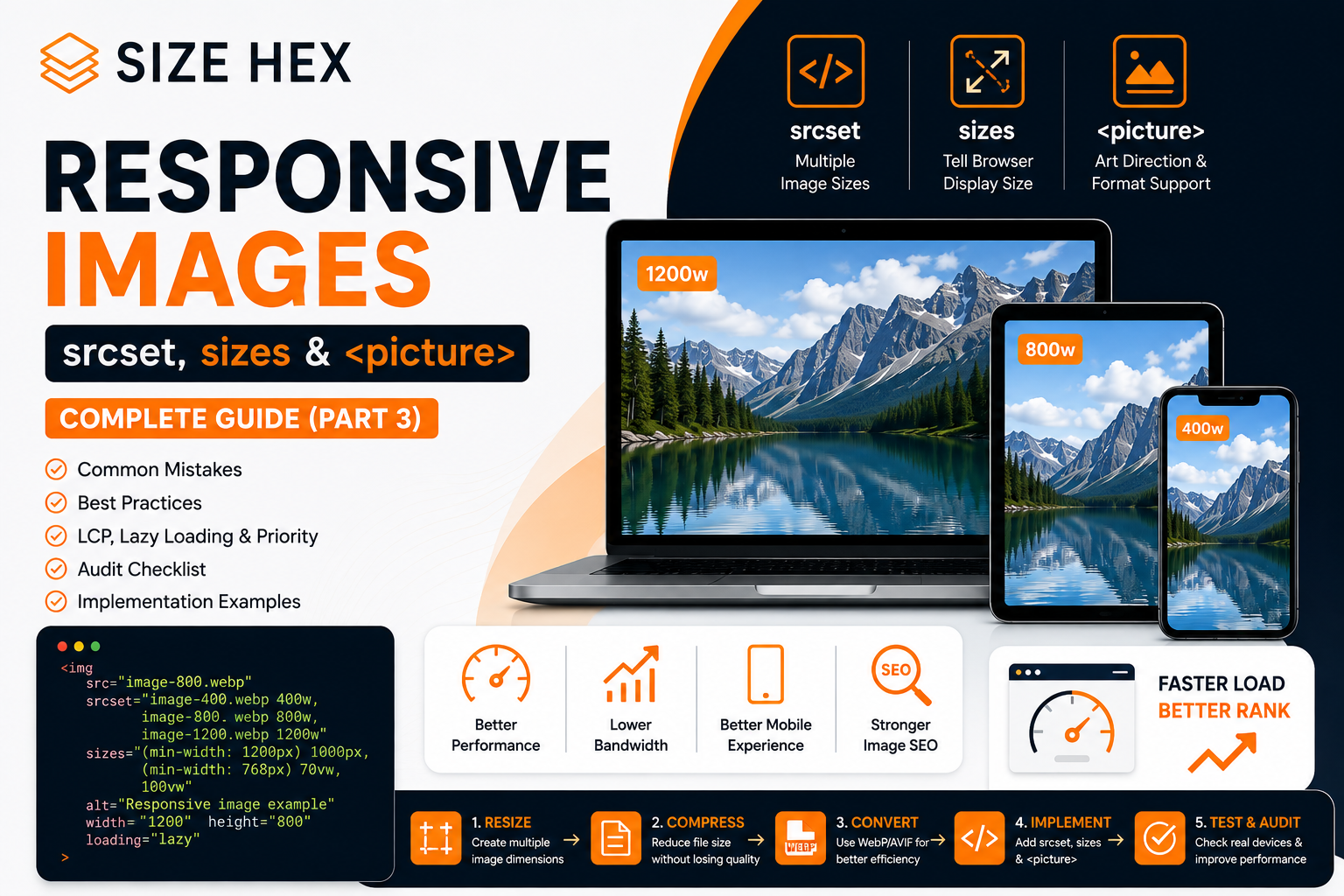
A website can have perfectly compressed images and still send unnecessarily large files to mobile users.
The problem isn't always the image format or compression level. Sometimes the problem is simply serving the wrong image dimensions for the device.
Imagine a hero image saved at 2000 × 1200 pixels.
On a desktop, that might make sense.
But if the same image is displayed at roughly 390 pixels wide on a phone, sending the full 2000-pixel version can waste bandwidth without providing a meaningful visual benefit.
This is exactly the problem responsive images are designed to solve.
Instead of giving every visitor the same image file, you provide several appropriate versions and let the browser select the most suitable one.
Google's web performance guidance notes that serving desktop-sized images to mobile devices can use significantly more data than necessary, while responsive images can reduce image resource duration and potentially improve LCP when the image is the LCP element.
What Are Responsive Images?
Responsive images are images that can adapt their source file to the user's browsing conditions.
Those conditions can include:
- Viewport width
- Display density
- Available image candidates
- Layout size
- Device characteristics
Instead of:
<imgsrc="hero-large.webp"alt="Website performance">
you can provide multiple versions:
<imgsrc="hero-800.webp"srcset="hero-400.webp 400w,hero-800.webp 800w,hero-1200.webp 1200w"alt="Website performance">
Now the browser has several image candidates to choose from.
The important detail is that you don't manually tell the browser which file to use for every device.
You describe the available resources, and the browser makes the selection.
That is one of the main purposes of srcset.
Why Serving One Large Image Isn't Ideal
Consider a website with this image:
hero.webp2000 × 1200850 KB
The CSS displays it at:
Desktop → 900px wideTablet → 700px wideMobile → 390px wide
If every visitor receives the 2000-pixel image, mobile users are downloading substantially more image data than the layout requires.
A better setup could be:
hero-400.webphero-800.webphero-1200.webp
The browser can then select an appropriate candidate.
Google's web.dev guidance recommends providing multiple image sizes and using srcset so the browser can select an appropriate resource rather than downloading an unnecessarily large image.
How srcset Works
The srcset attribute provides a list of image candidates.
For example:
<imgsrc="hero-800.webp"srcset="hero-400.webp 400w,hero-800.webp 800w,hero-1200.webp 1200w"alt="Responsive website hero image">
The important part is:
400w800w1200w
These are width descriptors.
They tell the browser:
hero-400.webp → 400 pixels widehero-800.webp → 800 pixels widehero-1200.webp → 1200 pixels wide
They don't tell CSS how large the image should appear.
They describe the intrinsic width of each source.
That distinction is important because srcset is about resource selection, not directly controlling layout.
srcset Doesn't Replace CSS
This is a common misunderstanding.
You might write:
<imgsrc="hero-800.webp"srcset="hero-400.webp 400w,hero-800.webp 800w,hero-1200.webp 1200w"alt="Hero image">
But this doesn't mean:
"Display this image at 400px, 800px or 1200px."
Your CSS still determines the rendered size.
For example:
.hero img {width: 100%;max-width: 900px;height: auto;}
srcset gives the browser information about the available resources.
CSS determines how the element behaves in the layout.
web.dev explicitly notes that srcset describes image-source widths and does not specify the displayed size.
Then What Does sizes Do?
This is where things become more interesting.
Suppose your image is:
.article-image {width: 50%;}
On a 1200px viewport, the image might appear around 600px wide.
If the browser doesn't know that when selecting an image candidate, it may choose a larger source than necessary.
That's where sizes helps.
<imgsrc="hero-800.webp"srcset="hero-400.webp 400w,hero-800.webp 800w,hero-1200.webp 1200w"sizes="50vw"alt="Responsive hero image">
The browser can interpret:
sizes="50vw"
as:
"This image will occupy approximately 50% of the viewport width."
It can then combine that information with the srcset candidates to choose an appropriate source.
sizes Does Not Resize the Image
This is another important distinction.
This:
sizes="50vw"
does not mean:
Make the image 50% wide.
It describes the expected rendered width so the browser can make a better resource-selection decision.
Your CSS still controls the actual layout.
For example:
.article-image {width: 50%;}
The HTML and CSS are working together:
CSS↓Determines layout sizesizes↓Describes that expected size to the browsersrcset↓Provides possible image resourcesBrowser↓Chooses an appropriate candidate
This is the core concept behind responsive images.
A Real Responsive Image Example
Suppose an article has a two-column layout on desktop but becomes a single column on mobile.
You could write:
<imgsrc="article-800.webp"srcset="article-400.webp 400w,article-800.webp 800w,article-1200.webp 1200w"sizes="(min-width: 900px) 50vw,100vw"width="1200"height="800"alt="Responsive image example">
The browser gets information about the expected image width:
900px+ viewport→ approximately 50vwBelow 900px→ approximately 100vw
This gives the browser much better information when choosing an image resource.
The sizes attribute supports multiple conditions, and the browser uses the first matching condition.
Why This Matters for Mobile SEO
Responsive images aren't a secret Google ranking trick.
Their main benefit is performance and efficient resource delivery.
Imagine:
Without responsive images
Mobile visitor↓Downloads 1600px image↓Only displays 390px
With responsive images
Mobile visitor↓Browser evaluates candidates↓Chooses suitable source↓Downloads smaller resource↓Displays image
Less unnecessary image data can mean shorter image resource load times.
If that image is also the LCP element, reducing its resource load duration can contribute to better LCP.
Responsive Images and LCP
This is particularly important for hero images.
Suppose your homepage has:
Hero image↓Largest visible element↓LCP
And the original image is:
2000 × 12001.2 MB
A mobile user might only need something closer to:
480 × 288120 KB
Sending the smaller appropriate resource can reduce the amount of data that needs to be transferred.
That doesn't guarantee a better LCP by itself, because LCP also depends on discovery, network conditions, server response, rendering and other factors.
But responsive delivery can remove unnecessary image bytes from the critical path.
web.dev specifically notes this relationship between responsive images, resource load duration and LCP.
What Is the <picture> Element?
<picture> is another responsive-image technique, but it solves a slightly different problem.
Consider:
<picture><sourcemedia="(max-width: 768px)"srcset="hero-mobile.webp"><imgsrc="hero-desktop.webp"alt="Responsive hero image"></picture>
Now you're not simply giving the browser different sizes of the same image.
You're allowing different sources to be used under different conditions.
This is especially useful for art direction.
What Is Art Direction?
Imagine a desktop hero:
┌──────────────────────────────────────────┐│ ││ PERSON PRODUCT ││ │└──────────────────────────────────────────┘
On mobile, shrinking that same image could make the important subject too small.
Instead, you create a separate crop:
┌──────────────┐│ ││ PERSON ││ ││ PRODUCT ││ │└──────────────┘
Now you have:
Desktop → hero-desktop.webpMobile → hero-mobile.webp
That's art direction.
The <picture> element is designed for situations where the actual image composition needs to change across viewport conditions.
srcset vs <picture>
The easiest way to understand the difference is:
srcset
"Here are different versions of the same image. Choose the appropriate one."
<picture>
"Here are different image sources that may represent different compositions or formats."
For example:
Same image, different sizes
<imgsrc="product-800.webp"srcset="product-400.webp 400w,product-800.webp 800w,product-1200.webp 1200w"sizes="100vw"alt="Product">
Use srcset.
Different mobile crop
<picture><sourcemedia="(max-width: 768px)"srcset="product-mobile.webp"><imgsrc="product-desktop.webp"alt="Product"></picture>
Use <picture>.
You Can Also Use <picture> for Image Formats
<picture> isn't limited to art direction.
It can also provide different formats.
For example:
<picture><sourcesrcset="hero.avif"type="image/avif"><sourcesrcset="hero.webp"type="image/webp"><imgsrc="hero.jpg"alt="Website performance illustration"></picture>
The browser can select a supported source, with the <img> providing the fallback.
This is useful when you're serving modern formats while maintaining a fallback for browsers that don't support a particular format.
Don't Forget the src Fallback
A responsive <img> should still have a normal src.
For example:
<imgsrc="hero-800.webp"srcset="hero-400.webp 400w,hero-800.webp 800w,hero-1200.webp 1200w"sizes="100vw"alt="Responsive hero image">
The src isn't obsolete just because srcset exists.
It provides a fallback and is important for broad compatibility.
web.dev documents src as the fallback resource when srcset and sizes aren't supported.
Don't Create 20 Versions of Every Image
Responsive images don't mean:
image-100.webpimage-150.webpimage-200.webpimage-250.webpimage-300.webp...image-3000.webp
You don't need an image for every possible viewport width.
A practical setup might use:
400px800px1200px1600px
The exact number depends on your site's layouts and traffic.
web.dev notes that there isn't one universally correct number of image versions; three to five sizes is a common practical range.
Image Dimensions Still Matter
Responsive images work best when the source files themselves are sensible.
Suppose you have:
hero-400.webp → 400pxhero-800.webp → 800pxhero-1200.webp → 1200px
but each file is unnecessarily huge because of inefficient encoding.
srcset doesn't fix that.
You still need to:
- Resize
- Compress
- Choose appropriate formats
- Avoid unnecessarily large dimensions
Google's web performance guidance recommends serving images at appropriate dimensions rather than sending unnecessarily large images.
Always Set width and height
Responsive images should also reserve the correct amount of layout space.
For example:
<imgsrc="hero-800.webp"srcset="hero-400.webp 400w,hero-800.webp 800w,hero-1200.webp 1200w"sizes="100vw"width="1200"height="800"alt="Responsive hero image">
Why?
Because the browser can use the intrinsic dimensions to reserve space before the image finishes loading.
Without dimensions, an image can load and push other content downward, contributing to Cumulative Layout Shift (CLS).
web.dev recommends specifying image width and height to reserve space and avoid layout shifts.
Responsive Images + Lazy Loading
These techniques can work together.
For an article image below the fold:
<imgsrc="article-800.webp"srcset="article-400.webp 400w,article-800.webp 800w,article-1200.webp 1200w"sizes="100vw"width="1200"height="800"loading="lazy"alt="Image optimization workflow">
Here:
srcset
helps select an appropriate image source.
sizes
describes the expected display width.
loading="lazy"
tells the browser the image isn't needed immediately.
These attributes solve different problems.
But Don't Lazy-Load the LCP Image
If the responsive image is your hero/LCP image, don't automatically add:
loading="lazy"
The image is needed for the initial viewport.
For a critical LCP image, normal loading and appropriate prioritization are generally more suitable.
This connects directly to our previous article about image preloading and fetchpriority.
Responsive images determine which resource the browser should use.
Priority mechanisms help determine how that resource should be treated during loading.
A Complete Responsive Hero Example
Here's a practical implementation:
<imgsrc="/images/hero-800.webp"srcset="/images/hero-400.webp 400w,/images/hero-800.webp 800w,/images/hero-1200.webp 1200w,/images/hero-1600.webp 1600w"sizes="(min-width: 1200px) 900px,(min-width: 768px) 70vw,100vw"width="1600"height="900"fetchpriority="high"alt="Responsive image optimization workflow">
Here:
-
srcprovides the fallback -
srcsetprovides multiple resources -
sizesdescribes the rendered width -
widthandheightreserve layout space -
fetchpriority="high"communicates that the image is important -
altdescribes the image
This is a much more complete implementation than simply:
<img src="hero-1600.webp">
What Happens When a User Opens the Page?
The browser doesn't simply choose the biggest image.
It has information such as:
Viewport widthDisplay densityAvailable candidatessizes valueNetwork conditionsBrowser heuristics
It then selects a suitable source from the candidates.
The important thing is that you don't need JavaScript to manually detect:
if (window.innerWidth < 768) {image.src = "small.webp";}
Using native responsive-image syntax lets the browser handle resource selection itself.
That is one reason srcset and sizes are preferable to building your own JavaScript image-switching system for ordinary responsive image delivery.
Why JavaScript-Based Image Switching Can Be a Bad Idea
A common approach looks like this:
if (window.innerWidth < 768) {image.src = "hero-mobile.webp";} else {image.src = "hero-desktop.webp";}
The problem is that the browser may initially discover one resource and then JavaScript changes it.
For critical images, this can introduce unnecessary work and potentially delay resource discovery.
Native responsive-image markup allows the browser to make the selection much earlier during HTML parsing.
This is particularly important when the image is part of the critical rendering path.
The SEO Connection
Responsive images aren't a standalone Google ranking factor.
The SEO benefit is indirect but important:
Responsive images↓Smaller appropriate resources↓Less unnecessary data↓Faster image loading↓Potentially better page experience
And if your image is the LCP element:
Responsive image↓Lower resource load duration↓Potentially faster LCP
web.dev explicitly connects responsive image delivery with reduced resource load duration and LCP improvements when the image is the LCP element.
One More Important Detail: Don't Confuse srcset With Breakpoints
You might see:
srcset="image-400.webp 400w,image-800.webp 800w,image-1200.webp 1200w"
and assume:
400w → mobile800w → tablet1200w → desktop
That's an oversimplification.
The w values describe the intrinsic width of each source.
The browser considers those candidates together with the image's sizes, viewport, display density and other information when selecting the resource.
srcset isn't simply a CSS media-query replacement.
A Better Mental Model
Think of responsive images like a restaurant menu.
You don't give every customer the largest meal.
You provide several options:
SmallMediumLarge
Then the customer chooses what fits.
With responsive images:
400px800px1200px1600px
The browser chooses the candidate that best fits the user's current situation.
Your job is to provide good choices and accurate information.
The browser does the selection.
How This Fits Into SizeHex
This is especially relevant to SizeHex because the entire product is built around image optimization.
A user might use:
SizeHex Image Resizer
to create:
400px800px1200px
versions of an image.
Then the website developer can implement them with:
srcset
and:
sizes
For example, if you need to prepare multiple dimensions before adding them to a website, the SizeHex Image Resizer can be part of that workflow.
If the files are still unnecessarily large afterward, the SizeHex Image Compressor can reduce their file size before deployment.
And if you're using WebP versions, the SizeHex WebP Converter can fit into the preparation stage.
The important distinction is:
SizeHex tools→ Prepare efficient image filessrcset + sizes→ Deliver an appropriate file to each user
Those are two different parts of image optimization.
The Complete Workflow
For a production website, the process can look like this:
Original image↓Resize↓Create multiple useful dimensions↓Compress↓Choose appropriate format↓Upload image variants↓Implement srcset↓Describe layout with sizes↓Set width + height↓Choose loading strategy↓Set priority when appropriate↓Test performance
That's much more effective than simply uploading one enormous image and expecting the browser to solve everything automatically.
Testing Responsive Images
After implementing srcset and sizes, don't assume they're working.
Open Chrome DevTools.
Go to:
Network → Img
Then resize the browser or test different viewport sizes.
Check which image resource is actually being requested.
For example:
Desktop→ hero-1200.webpTablet→ hero-800.webpMobile→ hero-400.webp
The exact selection depends on the layout, sizes, viewport and device characteristics.
web.dev recommends using browser developer tools and Lighthouse to verify image sizing and identify images that are still larger than necessary.
The Three Attributes You Need to Remember
If you're building websites, remember these three:
srcset
Which image resources are available?
srcset="small.webp 400w, large.webp 1200w"
sizes
How wide will the image approximately be displayed?
sizes="100vw"
width + height
What are the image's intrinsic dimensions and how much layout space should be reserved?
width="1200"height="800"
Together, they form the foundation of a solid responsive-image implementation.
The Practical Rule
If you're serving the same image at different sizes, start with:
<imgsrc="image-800.webp"srcset="image-400.webp 400w,image-800.webp 800w,image-1200.webp 1200w"sizes="100vw"width="1200"height="800"alt="...">
If you're serving different compositions for mobile and desktop, use:
<picture><sourcemedia="(max-width: 768px)"srcset="image-mobile.webp"><imgsrc="image-desktop.webp"alt="..."></picture>
And if the image is important to the initial page experience, combine the responsive setup with an appropriate loading and priority strategy rather than automatically lazy-loading it.
That gives you a clean foundation for delivering images that are smaller, faster, and better suited to the device actually viewing them.
Understanding How the Browser Chooses an Image
Writing srcset correctly is only the first step. The real advantage comes from giving the browser enough information to choose an image that fits the user's screen and the way the image is actually displayed.
Consider this:
<imgsrc="product-800.webp"srcset="product-400.webp 400w,product-800.webp 800w,product-1200.webp 1200w"sizes="100vw"width="1200"height="800"alt="Product image">
The browser doesn't simply choose product-400.webp for every phone and product-1200.webp for every desktop.
It considers the image's expected display size, viewport, device pixel ratio and the available candidates before making its selection. (web.dev)
That's why the sizes attribute matters so much.
sizes="100vw" Isn't Always Correct
A common mistake is to copy:
sizes="100vw"
onto every image.
It means:
The image is expected to occupy approximately the full viewport width.
That's appropriate for an image that actually behaves that way.
For example:
.hero img {width: 100%;}
But suppose your article layout looks like this:
┌──────────────────────────────────────────────┐│ Header │├───────────────┬──────────────────────────────┤│ │ ││ Article │ Sidebar ││ 70% │ 30% ││ │ │└───────────────┴──────────────────────────────┘
The article image may only occupy around 70% of the viewport.
In that situation:
sizes="70vw"
may describe the layout more accurately.
For responsive layouts with multiple breakpoints, you can be more precise:
sizes="(min-width: 1200px) 800px,(min-width: 768px) 70vw,100vw"
The browser evaluates the conditions from left to right and uses the first matching one. (web.dev)
A Real Blog Layout Example
Imagine a SizeHex article page.
On desktop:
Viewport: 1440pxArticle: 900pxSidebar: 300px
On tablet:
Viewport: 900pxArticle: 700px
On mobile:
Viewport: 390pxArticle: 390px
Your image might use:
<imgsrc="/images/article-800.webp"srcset="/images/article-400.webp 400w,/images/article-800.webp 800w,/images/article-1200.webp 1200w"sizes="(min-width: 1200px) 900px,(min-width: 768px) 78vw,100vw"width="1200"height="800"alt="Responsive image example">
Now the browser has a much more realistic description of the layout.
Why Incorrect sizes Can Waste Bandwidth
Suppose the image is actually displayed at:
500px
but you tell the browser:
sizes="100vw"
on a 1440px screen.
The browser may choose a significantly larger candidate than necessary.
For example:
Actual display:500pxAvailable:400px800px1200pxBrowser may choose:800px
But if your layout information is more accurate, the browser can make a better decision.
This is why sizes isn't just a technical formality.
It directly affects which image resource the browser considers appropriate.
web.dev recommends matching sizes to the actual rendered width of the image. (web.dev)
Device Pixel Ratio Changes the Calculation
There is another factor developers often forget:
Device Pixel Ratio (DPR).
A phone might have a CSS viewport around:
390 CSS pixels
but a device pixel ratio of:
3
That means the browser may need a higher-resolution source to display the image sharply.
This is another reason you shouldn't manually implement:
if (width < 500) {image.src = "400.webp";}
The browser has more information than just viewport width.
It can consider the available candidates and the device's display characteristics when choosing a resource. (web.dev)
Don't Make the Smallest File Too Small
Responsive images aren't about always choosing the smallest possible file.
Suppose:
400px image
is technically enough for a phone's CSS width, but the device has a high-density display.
A slightly larger candidate may produce a better visual result.
Your job is therefore to provide reasonable image candidates, not force the browser into one fixed choice.
For example:
400w800w1200w1600w
is often more practical than creating dozens of tiny increments.
How Many Image Sizes Should You Create?
There's no universal number.
It depends on:
- Your site's layouts
- Typical image dimensions
- Mobile traffic
- Desktop traffic
- CDN/image pipeline
- Storage requirements
- Performance targets
For many websites, something like:
400px800px1200px1600px
is a reasonable starting point.
But an e-commerce website with many different product-card sizes may benefit from more variants.
The objective is to balance:
Good image selection
against:
Too many files to manage.
Responsive Images for Blog Featured Images
This is especially useful for SizeHex's blog pages.
Suppose a featured image is displayed:
Desktop → 1000pxTablet → 750pxMobile → 390px
Instead of:
<img src="blog-cover-1600.webp">
use:
<imgsrc="/images/blog-cover-800.webp"srcset="/images/blog-cover-400.webp 400w,/images/blog-cover-800.webp 800w,/images/blog-cover-1200.webp 1200w,/images/blog-cover-1600.webp 1600w"sizes="(min-width: 1200px) 1000px,(min-width: 768px) 750px,100vw"width="1600"height="900"alt="Responsive images SEO guide">
This gives the browser enough information to select an appropriate candidate.
What About Blog Images That Aren't Visible Yet?
Not every image on an article needs to compete for the initial network bandwidth.
For images far below the fold:
<imgsrc="/images/example-800.webp"srcset="/images/example-400.webp 400w,/images/example-800.webp 800w,/images/example-1200.webp 1200w"sizes="100vw"width="1200"height="800"loading="lazy"alt="Image optimization example">
Here:
srcset→ Chooses an appropriate sourcesizes→ Describes the rendered widthloading="lazy"→ Defers loading until the image is closer to the viewport
These are complementary features.
Don't Lazy-Load Everything
A common optimization mistake is:
"Images are slowing my website down, so I'll add
loading="lazy"to every image."
That can be counterproductive.
Your initial viewport needs its critical images immediately.
For example:
Hero image→ Don't lazy-loadFirst visible article image→ Depends on layoutImages far below the fold→ Lazy-load
web.dev recommends avoiding lazy loading the LCP image because delaying its request can negatively affect LCP. (web.dev)
Responsive Images and fetchpriority
These two features also work at different levels.
Responsive image selection
srcsetsizes
answers:
Which image should the browser download?
Fetch priority
fetchpriority="high"
answers:
How important is this resource relative to others?
For example:
<imgsrc="/images/hero-800.webp"srcset="/images/hero-400.webp 400w,/images/hero-800.webp 800w,/images/hero-1200.webp 1200w"sizes="100vw"width="1200"height="800"fetchpriority="high"alt="Website performance illustration">
This combination can make sense for a critical responsive hero image.
But fetchpriority="high" should still be used selectively. web.dev recommends reserving high priority for genuinely important resources rather than applying it broadly. (web.dev)
Responsive Images and Preload
Preloading responsive images requires extra care.
You shouldn't simply do:
<linkrel="preload"as="image"href="/images/hero-1600.webp">
if your page uses several responsive candidates.
On a mobile device, that could cause the browser to preload a much larger resource than it actually needs.
HTML provides imagesrcset and imagesizes for responsive image preloading:
<linkrel="preload"as="image"href="/images/hero-800.webp"imagesrcset="/images/hero-400.webp 400w,/images/hero-800.webp 800w,/images/hero-1200.webp 1200w"imagesizes="100vw"fetchpriority="high">
This allows the preload hint to describe the responsive candidates.
web.dev documents this technique for responsive image preloading. (web.dev)
When Should You Actually Preload a Responsive Image?
Don't automatically preload every responsive hero image.
First ask:
Is the image critical?
Then:
Is it the LCP element?
Then:
Is it discovered early through HTML?
If the answer is:
Critical → YesLCP → YesAlready discoverable → Yes
you may not need a preload at all.
If the image is difficult to discover early—for example, because it is a CSS background—preload can be more useful.
This follows the same principle we discussed in the previous image preloading and fetchpriority article.
Responsive Images and CSS Backgrounds
CSS background images don't work with srcset directly.
You could write:
.hero {background-image: url("/images/hero.webp");}
But if you need different background images at different breakpoints, CSS media queries can be used:
.hero {background-image: url("/images/hero-desktop.webp");}@media (max-width: 768px) {.hero {background-image: url("/images/hero-mobile.webp");}}
This can be useful when the image is purely decorative.
However, if the image is meaningful page content or your LCP element, an HTML <img> may be a better implementation.
Google's image documentation and web.dev guidance generally favor standard HTML image elements for important images because they provide better discoverability and responsive-image capabilities. (developers.google.com)
Use <picture> for Art Direction, Not Every Responsive Image
This is another common mistake.
You don't need:
<picture>
just because your website is responsive.
If you're using the same image with different dimensions:
400px800px1200px
srcset and sizes are usually enough.
Use <picture> when you genuinely need:
- Different crops
- Different compositions
- Different image formats
- Different media conditions
For example:
<picture><sourcemedia="(max-width: 600px)"srcset="/images/product-mobile.webp"><imgsrc="/images/product-desktop.webp"alt="Product"></picture>
The mobile and desktop images can now be designed specifically for their respective layouts.
Mobile Art Direction Can Be Better Than Scaling
Suppose your desktop image contains:
Person + laptop + large background
At 390px wide, shrinking the entire image might make the person and laptop almost impossible to see.
Instead:
Desktop:Wide compositionMobile:Close-up composition
The mobile source can remove unnecessary visual space.
This isn't just about performance.
It can also improve the actual visual experience.
That's one of the main reasons the <picture> element exists. (web.dev)
Don't Forget Image Compression
Responsive delivery and compression solve different problems.
Suppose:
hero-400.webp = 150 KBhero-800.webp = 400 KBhero-1200.webp = 900 KB
These are still fairly large.
You can make the responsive structure correct and still have inefficient files.
A better workflow is:
Original↓Crop if necessary↓Resize to useful dimensions↓Compress each version↓Choose format↓Implement srcset↓Implement sizes
For preparing those versions, you can use the SizeHex Image Resizer and then reduce their file sizes with the SizeHex Image Compressor.
If you need WebP versions, the SizeHex WebP Converter can be used before adding them to your site's responsive-image setup.
A Useful File Naming System
Once you start generating multiple variants, consistent filenames become important.
Instead of:
image1.webpimage2.webpimage3.webp
use:
hero-400.webphero-800.webphero-1200.webphero-1600.webp
For an article:
responsive-images-guide-400.webpresponsive-images-guide-800.webpresponsive-images-guide-1200.webp
This makes your image pipeline much easier to maintain.
Don't Put Dimensions in the Alt Text
This is not useful:
alt="responsive image 1200x800"
Instead:
alt="Responsive image showing multiple image sizes"
The alt text should describe the image's purpose or content.
Google's image SEO guidance recommends using descriptive alt text and relevant context rather than keyword stuffing. (developers.google.com)
Image File Names Still Matter
A filename like:
IMG_8291.webp
provides little useful context.
A filename like:
responsive-images-srcset-example.webp
is more descriptive.
But don't turn filenames into keyword stuffing:
responsive-images-seo-responsive-images-srcset-responsive-images-guide.webp
That's unnecessary.
Use short, descriptive names that accurately describe the image.
Google's image guidance recommends descriptive filenames and relevant surrounding context as part of making images understandable to search engines. (developers.google.com)
Responsive Images and Google Image Search
Responsive image syntax doesn't prevent Google from understanding your images.
Google can process standard HTML image implementations, including responsive images.
The important things are:
- The image should be accessible
- The page should be crawlable
- The image URL should be discoverable
- The implementation should use standard HTML
- The image should have appropriate context
- Important images shouldn't depend entirely on user interaction
Google's current documentation recommends making images discoverable through crawlable HTML and following standard image SEO practices. (developers.google.com)
What About Lazy-Loaded Responsive Images?
A normal implementation can look like:
<imgsrc="/images/example-800.webp"srcset="/images/example-400.webp 400w,/images/example-800.webp 800w,/images/example-1200.webp 1200w"sizes="100vw"width="1200"height="800"loading="lazy"alt="Responsive image example">
Google can process lazy-loaded images when they're implemented correctly and become available based on viewport conditions.
The important distinction is:
Lazy loading should defer non-critical images, not hide important content behind a click or JavaScript interaction.
Google's documentation recommends ensuring that lazy-loaded content is available when it enters the viewport and doesn't require user interaction for discovery. (developers.google.com)
A Practical Image Strategy for SizeHex
For SizeHex's own website, I'd structure image delivery roughly like this:
Homepage hero
Responsive+Optimized+Normal loading+High priority if it is LCP
Tool screenshots above the fold
Optimized+Responsive+Normal loading where needed
Tool screenshots below the fold
Responsive+Lazy loading
Blog featured image
Responsive+Optimized+Don't lazy-load if it's LCP
Blog images deep inside article
Responsive+Lazy loading
Decorative backgrounds
CSS+Responsive media queries where appropriate
This avoids treating every image on the website the same way.
Test What the Browser Actually Downloads
After implementing responsive images, open:
Chrome DevTools → Network → Img
Then test:
Desktop
Resize to a large viewport.
Tablet
Use a medium viewport.
Mobile
Use a small viewport.
Look at the actual requested URL.
For example:
Desktop→ hero-1200.webpTablet→ hero-800.webpMobile→ hero-400.webp
If every device downloads:
hero-1600.webp
then your responsive implementation or sizes value may need investigation.
Chrome DevTools can also show the image's intrinsic and rendered dimensions, which makes it easier to identify oversized resources.
Don't Judge the Implementation Only by PageSpeed Score
A responsive-image implementation can be technically correct even if your Lighthouse score doesn't suddenly jump from:
78 → 100
Performance is affected by many other factors:
- Server response
- CSS
- JavaScript
- Fonts
- Third-party resources
- Caching
- Network conditions
- Image decoding
- Rendering
Responsive images are one part of the overall performance strategy.
The goal is to eliminate unnecessary image bytes and loading work, not chase a perfect score.
A Simple Before-and-After Example
Before
<imgsrc="/images/blog-1600.webp"width="1600"height="900"alt="Image optimization">
Every user receives the same resource.
After
<imgsrc="/images/blog-800.webp"srcset="/images/blog-400.webp 400w,/images/blog-800.webp 800w,/images/blog-1200.webp 1200w,/images/blog-1600.webp 1600w"sizes="(min-width: 1200px) 1000px,(min-width: 768px) 75vw,100vw"width="1600"height="900"alt="Image optimization">
Now the browser has much better information about:
what resources exist
and
how large the image will actually appear.
That is the real benefit of responsive images.
The Bigger SEO Picture
Responsive images are one part of a larger image SEO system:
Descriptive filename↓Useful alt text↓Relevant surrounding content↓Correct dimensions↓Compression↓Modern image format↓Responsive srcset↓Accurate sizes↓Correct loading strategy↓Appropriate priority↓Fast delivery
No single attribute is responsible for making an image "SEO optimized."
The result comes from getting the entire chain right.
Google's image documentation recommends focusing on discoverability, relevant context, descriptive image information and technically sound implementations rather than treating one HTML attribute as an SEO shortcut. (developers.google.com)
One Rule Worth Remembering
When you're building a responsive website, don't ask:
"How do I make this image smaller?"
Ask:
"What is the smallest appropriate resource I can deliver for the way this image is actually being displayed?"
That shift in thinking is what makes srcset and sizes so useful.
You aren't simply compressing an image.
You're designing an image delivery system that adapts to the user's screen and the page layout.
Common Responsive Image Mistakes That Hurt Performance
Responsive images are powerful, but only when the browser receives accurate information.
A few implementation mistakes can completely undermine the optimization.
Mistake 1: Using only one huge image
<imgsrc="hero-2000.webp"width="2000"height="1200"alt="Hero image">
Even if the image is compressed, you're still potentially sending a desktop-sized resource to mobile users.
A better approach is to create useful image candidates and let the browser choose:
<imgsrc="hero-800.webp"srcset="hero-400.webp 400w,hero-800.webp 800w,hero-1200.webp 1200w,hero-1600.webp 1600w"sizes="100vw"width="1600"height="960"alt="Hero image">
Mistake 2: Using srcset Without Understanding sizes
This is extremely common:
<imgsrc="image-800.webp"srcset="image-400.webp 400w,image-800.webp 800w,image-1200.webp 1200w"alt="Example">
The browser has candidate widths, but you haven't described how wide the image is expected to appear.
For a full-width image, you might use:
sizes="100vw"
For a two-column layout:
sizes="50vw"
For a more complex layout:
sizes="(min-width: 1200px) 800px,(min-width: 768px) 70vw,100vw"
The more accurately sizes describes the actual layout, the better information the browser has when selecting a candidate. (web.dev)
Mistake 3: Creating Too Many Image Variants
You don't need:
image-100.webpimage-150.webpimage-200.webpimage-250.webpimage-300.webpimage-350.webpimage-400.webp...
That creates unnecessary files and complicates your image pipeline.
A sensible set might be:
400w800w1200w1600w
The right sizes depend on your site's actual layouts and traffic.
The goal is to provide enough choices without creating an unnecessarily complicated asset library. (web.dev)
Mistake 4: Using 100vw Everywhere
This is another copy-paste problem.
If an image is inside a 700px article column, this:
sizes="100vw"
may not accurately describe the layout.
For example:
Viewport: 1440pxArticle: 850px
The image may actually occupy:
850px
rather than:
1440px
A more realistic declaration might be:
sizes="850px"
or a responsive combination:
sizes="(min-width: 1200px) 850px,(min-width: 768px) 75vw,100vw"
Don't blindly copy 100vw. Match it to the actual CSS layout.
Mistake 5: Forgetting width and height
This:
<imgsrc="image.webp"alt="Example">
gives the browser less information about the image's dimensions before the resource is loaded.
Prefer:
<imgsrc="image.webp"width="1200"height="800"alt="Example">
The browser can use these dimensions to reserve the appropriate space.
This helps reduce unexpected layout movement while images load. web.dev recommends specifying image dimensions to help prevent layout shifts. (web.dev)
Mistake 6: Lazy-Loading the Hero Image
Avoid:
<imgsrc="hero.webp"loading="lazy"alt="Hero">
if that image is the LCP element.
The browser needs it immediately.
Lazy loading is much more appropriate for content further down the page.
Google's web performance guidance specifically recommends avoiding lazy loading the LCP image. (web.dev)
Mistake 7: Using JavaScript Instead of Native Responsive Images
You could write:
if (window.innerWidth < 768) {image.src = "hero-mobile.webp";} else {image.src = "hero-desktop.webp";}
But for ordinary responsive image delivery, this is unnecessary.
The browser already supports:
srcsetsizes
and can make the resource-selection decision without waiting for your JavaScript.
For critical images, reducing unnecessary JavaScript-dependent discovery can be particularly useful for performance. (web.dev)
Mistake 8: Using <picture> When srcset Is Enough
This:
<picture><sourcemedia="(max-width: 768px)"srcset="image-mobile.webp"><imgsrc="image-desktop.webp"alt="Example"></picture>
is useful when the actual source needs to change.
But if you simply have:
400px800px1200px
versions of the same image, you usually don't need <picture>.
Use:
<imgsrc="image-800.webp"srcset="image-400.webp 400w,image-800.webp 800w,image-1200.webp 1200w"sizes="100vw"alt="Example">
Use <picture> when you need art direction or format/source selection. (web.dev)
Mistake 9: Forgetting a Fallback
Don't build an unnecessarily fragile <picture> implementation.
Use a normal <img> fallback:
<picture><sourcetype="image/avif"srcset="hero.avif"><sourcetype="image/webp"srcset="hero.webp"><imgsrc="hero.jpg"alt="Website hero"width="1200"height="800"></picture>
The <img> is the actual fallback image.
Google's image documentation recommends standard HTML image implementations that remain accessible and discoverable. (developers.google.com)
Mistake 10: Optimizing Dimensions but Ignoring File Size
Suppose you create:
400 × 300 → 500 KB800 × 600 → 1.2 MB1200 × 900 → 2.5 MB
Your responsive architecture may be perfect.
The files are still inefficient.
Responsive images solve which resource to deliver.
Compression solves how much data that resource contains.
You need both.
Responsive Images for Different Content Types
Not every image on a website needs the same strategy.
Hero Images
Usually:
Responsive+Optimized+Correct dimensions+Normal loading+Priority when genuinely critical
Blog Images
Usually:
Responsive+Optimized+Correct dimensions+Lazy loading below the fold
Product Images
Usually:
Responsive+Multiple sizes+Consistent aspect ratio+Appropriate compression
Decorative Images
Could use:
CSS background
if they're purely decorative.
Logos
Usually don't need a huge number of responsive variants.
The implementation should match the actual use case.
Responsive Images for E-Commerce
Imagine a product card:
Desktop:Image displayed at 280pxMobile:Image displayed at 160px
Instead of sending a 1200px image to every visitor:
<imgsrc="product-400.webp"srcset="product-200.webp 200w,product-400.webp 400w,product-800.webp 800w"sizes="(min-width: 1024px) 280px,160px"width="800"height="800"alt="Product image">
This can significantly reduce unnecessary image transfer when a page contains many product images.
Responsive Images for Social Media Preview Images
There's an important distinction here.
Images displayed inside your page can use:
srcsetsizes
But social sharing metadata such as:
<meta property="og:image" content="...">
is a different system.
Don't expect srcset to automatically control how Facebook, LinkedIn or other platforms fetch your Open Graph image.
Keep your social preview image implementation separate from your normal responsive image system.
Responsive Images and Structured Data
If you're using structured data for articles, products or other content, make sure the image URLs you provide are valid and accessible.
For example, an Article structured-data image might point to:
https://example.com/images/article-cover.webp
That is different from the browser selecting:
article-cover-400.webparticle-cover-800.webp
for the visible page.
Structured data and responsive image delivery serve different purposes.
Don't mix the two systems unnecessarily.
Responsive Images and Image Sitemaps
If you're using an image sitemap, make sure the image URLs are accessible and consistent with the actual image resources on your website.
A responsive implementation doesn't mean Google needs every srcset candidate added as a separate page resource.
Your primary concern is making your important images discoverable and crawlable.
Google provides specific guidance for image sitemaps and image discovery. (developers.google.com)
How to Audit Responsive Images on SizeHex
This is where the topic becomes practical for our own website.
For every important SizeHex page, inspect:
Step 1 — Find the LCP element
Use:
Chrome DevTools → Performance
or PageSpeed Insights.
Determine whether the LCP element is:
ImageTextBackgroundOther element
Step 2 — Check the image markup
Look for:
<img>
and verify:
srcsrcsetsizeswidthheightaltloadingfetchpriority
Not every image needs every attribute.
The correct combination depends on the image's role.
Step 3 — Check the actual resource
Open:
Network → Img
and look at the requested image.
Ask:
Is the browser downloading a much larger file than the displayed image needs?
If yes, investigate srcset and sizes.
Step 4 — Test Mobile
Use Chrome's device emulation.
Test:
390px768px1024px1440px
Check which resources are requested.
Step 5 — Test Real Devices
Emulation is useful, but real devices and real networks can reveal different behavior.
Performance should ultimately be evaluated using real-world conditions where possible.
A Simple Responsive Image Audit Checklist
For each important image:
☐ Is the image actually needed?☐ Is the image appropriately compressed?☐ Are dimensions appropriate?☐ Does it have width/height?☐ Does it have useful alt text?☐ Is srcset useful here?☐ Is sizes accurate?☐ Is it above or below the fold?☐ Should it be lazy-loaded?☐ Is it the LCP image?☐ Does it need high priority?☐ Does it need preload?☐ Is the browser downloading an oversized resource?☐ Does mobile receive a sensible image?
This is a much better audit than simply checking whether a page contains srcset.
A Practical SizeHex Implementation
Let's say we're building a SizeHex blog article with a featured image.
The image variants are:
responsive-images-400.webpresponsive-images-800.webpresponsive-images-1200.webpresponsive-images-1600.webp
The HTML could be:
<imgsrc="/images/responsive-images-800.webp"srcset="/images/responsive-images-400.webp 400w,/images/responsive-images-800.webp 800w,/images/responsive-images-1200.webp 1200w,/images/responsive-images-1600.webp 1600w"sizes="(min-width: 1200px) 1000px,(min-width: 768px) 75vw,100vw"width="1600"height="900"fetchpriority="high"alt="Responsive images using srcset and sizes">
For an article image much further down:
<imgsrc="/images/srcset-example-800.webp"srcset="/images/srcset-example-400.webp 400w,/images/srcset-example-800.webp 800w,/images/srcset-example-1200.webp 1200w"sizes="100vw"width="1200"height="800"loading="lazy"alt="HTML responsive image example">
Now the loading strategy matches the image's position and importance.
Building an Image Pipeline for SizeHex
If you're managing lots of images, manually creating every variant can become tedious.
A good pipeline can look like:
Original upload↓Validate↓Resize↓Generate variants↓Compress↓Generate WebP/AVIF↓Store files↓Generate srcset↓Insert sizes↓Publish
For a larger production system, this can be automated.
For a static website, you can also generate variants during your build process.
The important thing is consistency.
Don't Generate Variants You Never Use
If your site only ever displays an image between 300px and 900px, generating:
2000px2400px3000px4000px
may simply create unnecessary storage.
Review your actual CSS layouts and traffic before deciding which dimensions to generate.
The best responsive-image strategy is based on real layouts, not arbitrary numbers.
Responsive Images Are Not Just a Mobile Technique
The name can make it sound like responsive images are mainly about phones.
They're not.
They're about matching the resource to the rendered size and viewing conditions.
That includes:
- Mobile
- Tablet
- Desktop
- High-DPI screens
- Different layout columns
- Different components
- Different image roles
A desktop user with a narrow sidebar image doesn't necessarily need the same source as a desktop user viewing a full-width hero.
What Should You Do If the Image Is Already Small?
Suppose an image is:
500 × 50045 KB
and is displayed at:
400 × 400
Don't complicate it unnecessarily.
You don't always need:
2003004005006008001000
Responsive images are useful when there is a meaningful difference between possible display sizes.
Optimization should solve real problems rather than introduce complexity for its own sake.
The Relationship Between All Our Image SEO Topics
We've now covered several pieces of the same system.
IMAGE SEO│┌───────────────┼───────────────┐│ │ │Discoverability Delivery Context│ │ ││ ┌─────┼─────┐ ││ │ │ │ │HTML srcset WebP CompressionURLs sizes AVIF│ │Google ResponsiveImages Images│└──────────┐│Performance│┌───────┼────────┐│ │ │LCP Lazy PriorityLoading
This is why these articles should be internally connected rather than treated as unrelated SEO posts.
Internal Links You Should Add
For this article, natural internal links should include:
Image Resizer
For creating appropriate image dimensions.
Image Compressor
For reducing unnecessary file size.
WebP Converter
For creating modern WebP assets.
Image Converter
For changing image formats.
Image SEO Guide
For broader image-search optimization.
Image Lazy Loading
For below-the-fold image loading.
LCP Guide
For understanding the performance impact of critical images.
Image Preloading & fetchpriority
For critical resource discovery and priority.
This creates a coherent Image SEO topic cluster instead of isolated articles.
How the Internal Linking Should Flow
The structure should look something like:
Image SEO Hub│┌─────────────┼─────────────┐↓ ↓ ↓Responsive Compression WebPImages Guide Guide│ │ │↓ ↓ ↓Resizer Compressor WebP Tool│↓Image Delivery│┌──┴─────────────┐↓ ↓Lazy Loading LCP↓ ↓Priority Preload
This is far more useful than having every article link only back to the homepage.
Don't Force Internal Links
There's another important rule.
Don't turn every paragraph into:
image compressor image resizer webp converter image converter image optimization...
That looks unnatural.
Links should appear where they genuinely help the reader.
For example:
If the original image is larger than the dimensions your layout needs, resize it before creating your responsive image variants.
That is a natural place to link to the Image Resizer.
Then:
After resizing, compress each version to avoid carrying unnecessary file weight into production.
That's a natural place for the Image Compressor.
Context matters.
How This Article Can Support SizeHex's Tools
This article has a useful relationship with your product.
The user isn't only learning:
"What is srcset?"
They're learning an actual workflow:
I have an image↓I need multiple sizes↓Resize it↓Compress each version↓Convert if necessary↓Add srcset↓Add sizes↓Test
That means the tool links are genuinely relevant.
That's exactly the kind of internal linking we want.
Final Implementation Template
If you need a simple starting point for a normal responsive image:
<imgsrc="/images/example-800.webp"srcset="/images/example-400.webp 400w,/images/example-800.webp 800w,/images/example-1200.webp 1200w"sizes="100vw"width="1200"height="800"alt="Descriptive image text">
For a below-the-fold image:
<imgsrc="/images/example-800.webp"srcset="/images/example-400.webp 400w,/images/example-800.webp 800w,/images/example-1200.webp 1200w"sizes="100vw"width="1200"height="800"loading="lazy"alt="Descriptive image text">
For different mobile and desktop compositions:
<picture><sourcemedia="(max-width: 768px)"srcset="/images/example-mobile.webp"><imgsrc="/images/example-desktop.webp"width="1600"height="900"alt="Descriptive image text"></picture>
For a critical responsive LCP image, consider appropriate priority:
<imgsrc="/images/hero-800.webp"srcset="/images/hero-400.webp 400w,/images/hero-800.webp 800w,/images/hero-1200.webp 1200w"sizes="100vw"width="1200"height="675"fetchpriority="high"alt="Responsive hero image">
The exact implementation should always match the actual layout and loading behavior.
What Actually Makes a Responsive Image SEO-Friendly?
It's not one attribute.
A strong implementation combines:
Discoverability
The image exists in crawlable HTML.
Correct dimensions
The browser knows the intrinsic dimensions.
Responsive candidates
The browser has appropriate resources to choose from.
Accurate sizes
The browser understands the expected rendered width.
Efficient formats
The files aren't unnecessarily heavy.
Compression
Each candidate is optimized.
Correct loading
Critical images aren't unnecessarily delayed.
Useful context
Alt text, filenames and surrounding content describe the image appropriately.
Google's image SEO documentation emphasizes crawlability, relevant context, descriptive image information and technically sound implementations rather than a single optimization technique. (developers.google.com)
The Bottom Line
Responsive images aren't about making your website automatically "SEO optimized."
They're about making sure your website doesn't send a 2000px image to someone who only needs 400px.
The core strategy is simple:
Create useful image sizes↓Compress them↓Use srcset↓Describe the layout with sizes↓Use <picture> when composition/format needs to change↓Set width + height↓Lazy-load non-critical images↓Prioritize genuinely critical images↓Test the actual resources being downloaded
For SizeHex, this also creates a natural connection between the site's tools and its educational content:
Resize → Compress → Convert → Deliver responsively → Measure.
That's the complete image optimization workflow.
And once you implement that workflow consistently across the site, you're not just optimizing individual images—you've built a scalable image delivery strategy that can support better performance, better user experience, and stronger technical foundations for image-focused SEO.
Related SizeHex Tools
If you're working on responsive images, these SizeHex tools can help you prepare the image files before adding srcset, sizes, or <picture> to your website:
- Image Resizer — Create different image dimensions for responsive layouts, such as 400px, 800px, and 1200px versions.
- Image Compressor — Reduce the file size of each responsive image variant before publishing it.
- WebP Converter — Convert compatible images to WebP for more efficient delivery.
- Image Converter — Convert images between supported formats when preparing assets for your website.
- Image Cropper — Create a different crop for mobile or desktop when you need art direction rather than simply resizing the same image.
Related SizeHex Guides
For a complete image optimization workflow, you may also want to read:
- Image Compression Guide — Learn how to reduce image file size while maintaining good visual quality.
- WebP Guide — Understand when WebP makes sense for modern websites.
-
Image Lazy Loading Guide — Learn when
loading="lazy"should and shouldn't be used. -
Image Preloading &
fetchpriorityGuide — Understand how critical images can be prioritized. - Image SEO Guide — Learn how image optimization, crawlability, filenames, alt text, and page context work together.